And away we go.
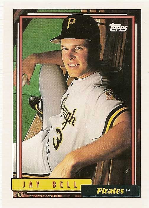
50) 1992 Topps
The '92 set featured some unique photography that largely still hasn't been replicated in style. I love the dugout shots. But when you get into the live action shots, the set gets pretty weak. The photos aren't as crisp as they could be, and the sizing and cropping is terrible. Add in a less than spectacular design, and the dugout photos and horizontal photography are really what save the set.
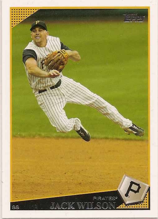
49) 2009 Topps
The 2009 set largely gets lost in the sea of late 00's white bordered sets. There are some nice photos, but the player selection was unspectacular. The Pirate roster certainly wasn't all that spectacular, but the checklist omitted quite a few players who played significant roles on the team. Luckily the Heritage release from that season picked up the slack where Flagship left off.
The 2009 set largely gets lost in the sea of late 00's white bordered sets. There are some nice photos, but the player selection was unspectacular. The Pirate roster certainly wasn't all that spectacular, but the checklist omitted quite a few players who played significant roles on the team. Luckily the Heritage release from that season picked up the slack where Flagship left off.

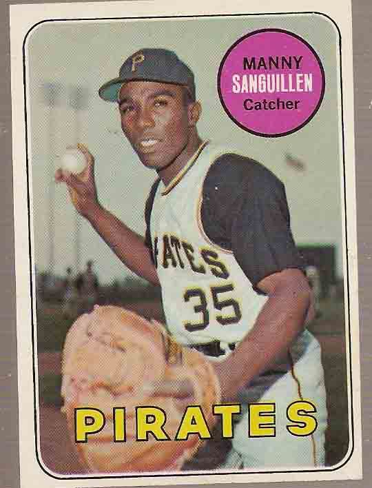
48) 1969 Topps
There's no purple. That alone moves this set up the rankings. But the photography makes some nice strides for the time, including some warm-up jacket photos and some more interesting posted shots. Of course Topps manages to backtrack again in '70.
There's no purple. That alone moves this set up the rankings. But the photography makes some nice strides for the time, including some warm-up jacket photos and some more interesting posted shots. Of course Topps manages to backtrack again in '70.

47) 2011 Topps
The Topps sets from the last 5 years or so really do run together. They're all fairly similar aesthetically, and the photography has shifted towards using an image service rather than unique photography.
The 2011 set just feels very mechanical to me. The circular logo at the bottom feels like a cog, and though I appreciate the minimalist text, the baseball logo feels like distracting overkill.


No comments:
Post a Comment