If anyone is interested in joining a 90's group break, check out my post. $20 per slot shipped, and lots of 90's/early 00's goodness.
A few more teams have been claimed, so more boxes have been added to the break since that post. It should be a really fun break, and a couple teams with starpower are still available, if anybody wants to roll the dice on hitting a nice Griffey, Piazza, or any of the Indians stars from the 90's.
Be sure to check back next week, and I'll post the haul from the break.
Saturday, February 28, 2015
Thursday, February 26, 2015
90's Group Break
 Apparently group breaks are all the rage these days. I guess I missed the memo, since I've been doing group breaks for years with a fantastic group of team collectors, including fellow blogger and all around great guy Mike G from The Sexy Geek's Sports Room.
Every few months we pool funds to bust some boxes of the latest releases. Our latest break is going to be a bunch of late 90's/early 2000's boxes, which anybody who even occasionally reads my blog knows is my collecting sweet spot.
We are a few members short for this break for one reason or another, so I wanted to open it up to see if any of my fellow bloggers would like to join in.
It's pretty simple - the buy in is $20 (shipping included), which gets you every single card of your team. It's s sliding pool (not a slip 'n slide, the cardboard kind), so the more people join in the more boxes we'll be able to buy. Right now we're slated to bust 9 boxes. More people = more boxes!
We're planning to collect money and put the order in by the end of the weekend to do the break around the middle of next week. The break will be live on Google Hangout with yours truly doing the ripping, and a fun time to hang around and talk about cards with other collectors.
Here's the list of boxes we're planning on opening, with more to be added if additional teams are claimed:
2000 Bowman Baseball Box (Hobby)
2000 Topps Stars Baseball Box (HTA)
2002 Upper Deck Victory Baseball Box (Hobby)
2002 Upper Deck MVP Baseball Box (Hobby)
1999 Fleer Ultra Baseball Box (Hobby)
1999 Bowman Baseball Series 1 Box (Hobby)
2001 Upper Deck SP Top Prospects Baseball Box (Hobby)
2003 Upper Deck Baseball 40 Man Box (Retail)
2004 Topps Baseball Series 1 1st Edition Box (HTA)
Teams Available:
Angels
Brewers
Diamondbacks
Dodgers
Giants
Indians
Mariners
Marlins
Mets
Phillies
Rangers
Rockies
Royals
Tigers
If you're interested, leave a comment or email me. It should be a really fun break, with hopefully a chance at a big card or two being pulled. If anyone has any questions, feel free to ask!
Tuesday, February 24, 2015
Sew What: Ranking MLB Uniforms
No uniform fetish here, but I have always loved the uniqueness of baseball uniforms. I think it goes back to t-ball, quite honestly. The first team I played on had those lame 90's tshirt jerseys, red trucker hats, and my pristine white baseball pants. I couldn't stand it! I made a point to get those white pants as dirty as possible, often before the game even started, often times making a point to make exaggerated catches during warmups or make unnecessary slides in the dirt. The next year I was on a team with powder blue uniforms. I was traumatized, suiting up every weekend in such an uninspiring color. But perhaps we should save the rest of that for a therapist's couch...
I grew up in what I consider to be a great era for logos and uniforms. Great is a subjective term that many would consider synonymous with hideous. But those cartoony 90's NBA jerseys? Loved 'em. The drug fueled Turn Ahead the Clock promotion? My holy grail. And while I have developed a great appreciation for clean, classic uniforms as I grew older, I think those early years formed an appreciation for just how awesome a jersey could be.
So with spring training kicking off, I'm going to deviate from the cardboard ramblings for a moment and rank the uniform sets of all 30 major league teams. I'm looking just at the primary on field set, ignoring any one-off throwbacks or warmup jerseys.
30) San Diego Padres
The Padres overhauled a pretty meh roster this off season with some really exciting additions. But I am not exaggerating when I say that I couldn't watch the team on mlb.tv the past two seasons because their jerseys were too bland to stare at for 9 innings. I'd love to check out the new look team, but without a literal new look, I can't see it happening. Bring back the brown and gold!
29) Arizona Diamondbacks
Somewhere the desert threw up. That's about the only way I can explain the mess that is the DBacks uniform. It's a crazy world when your teal and purple colors actually look like a good idea compared to the current batch.
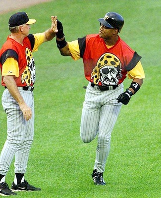
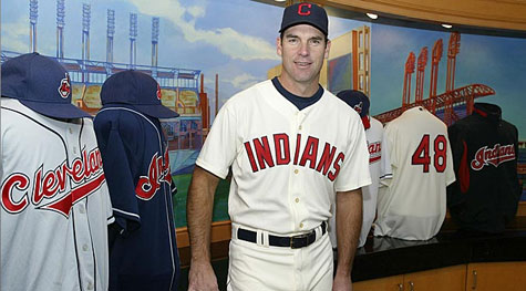
28) Cleveland Indians
This is a team that is at a bit of a crossroads, and could quickly shoot up my list with a couple tweaks. The team is clearly moving away from the racist chief wahoo logo, but the sad block C isn't any improvement. Retire the chief, and rebrand a featured logo. But their script Indians jersey is one of the best around, imo.
The "new" jersey just looks like a rehashing of the same design. And gold? Why gold?
26) Miami Marlins
The black jerseys feel sooooo 2004. But their orange jerseys actually match with the twisted art deco flair to their design and logo. Tubs and Crockett are proud.
25) San Francisco Giants
This is the lowest ranking of any of the "classic" jerseys. Why, you ask? Talk to that hideous orange jersey.
24) Milwaukee Brewers
The Brewers could be fighting off the Padres, if not for their classic throwback jerseys. The faded gold jersey isn't helping.
23) Houston Astros
I appreciate the fact that the Astros retired the hideous red/black colors. And the classic look is nice. But it's just kind of bland to me.
22) Atlanta Braves
Another victim of alternate-madness, the Braves have crapped all over a tradition-laden and nice home/road set with unnecessary alternates that look like batting practice rejects.
21) Texas RangersI liked the 90's red jersey set. I liked the blue jersey when it was reintroduced in the early 00's. What I don't like is the hideous 'Murica mix and match game they play. Red. Blue. Just pick one.

20) Cincinnati RedsAustin Kearns called and asked that you return the black trim to 2002.
19) Boston Red Sox
A couple years ago, the Red Sox would have been in my top 5. The blue font on the road jerseys and the unnecessary alternates made them take a "wicked hahd" tumble down the list.
18) Tampa Bay (Devil) Rays
The team exorcised the Devil, and started winning. But their uniforms weren't so fortunate. When your fauxback 1979 jersey is your best effort, you're in trouble.
17) Colorado Rockies
They get points for consistency, sticking with more or less the same jersey since their inception. But while I can stand behind the somewhat dated black/purple color scheme, the purple jerseys have seen more appropriate times. Barney, anyone?
16) The Angels of Somewhere in CaliforniaAnother victim of a team with a nice, and quite possibly modern classic, jersey set stretching to come up with an alternate. It's what all the cool kids are doing.
15) New York MetsDing, dong the black jerseys are dead. The blue alternates rock my socks, but the home/road set is a little uninspired. Bring back the 80's side striping!
14) St. Louis Cardinals
The decision to start wearing red hats on the road just looks so wrong. Had they stayed the course, this would be a top 3 team.
13) Pittsburgh PiratesNo hometown bias here. I've grown to like the Bucs blackout jersey. The Sunday alternates make my life a better place. But the block lettering on the road jersey does nothing for me. Pittsburgh is a word best spelled in script.
The black jerseys feel sooooo 2004. But their orange jerseys actually match with the twisted art deco flair to their design and logo. Tubs and Crockett are proud.
25) San Francisco Giants
This is the lowest ranking of any of the "classic" jerseys. Why, you ask? Talk to that hideous orange jersey.
24) Milwaukee Brewers
The Brewers could be fighting off the Padres, if not for their classic throwback jerseys. The faded gold jersey isn't helping.
23) Houston Astros
I appreciate the fact that the Astros retired the hideous red/black colors. And the classic look is nice. But it's just kind of bland to me.
22) Atlanta Braves
Another victim of alternate-madness, the Braves have crapped all over a tradition-laden and nice home/road set with unnecessary alternates that look like batting practice rejects.
21) Texas RangersI liked the 90's red jersey set. I liked the blue jersey when it was reintroduced in the early 00's. What I don't like is the hideous 'Murica mix and match game they play. Red. Blue. Just pick one.
19) Boston Red Sox
A couple years ago, the Red Sox would have been in my top 5. The blue font on the road jerseys and the unnecessary alternates made them take a "wicked hahd" tumble down the list.
18) Tampa Bay (Devil) Rays
The team exorcised the Devil, and started winning. But their uniforms weren't so fortunate. When your fauxback 1979 jersey is your best effort, you're in trouble.
17) Colorado Rockies
They get points for consistency, sticking with more or less the same jersey since their inception. But while I can stand behind the somewhat dated black/purple color scheme, the purple jerseys have seen more appropriate times. Barney, anyone?
16) The Angels of Somewhere in CaliforniaAnother victim of a team with a nice, and quite possibly modern classic, jersey set stretching to come up with an alternate. It's what all the cool kids are doing.
15) New York MetsDing, dong the black jerseys are dead. The blue alternates rock my socks, but the home/road set is a little uninspired. Bring back the 80's side striping!
14) St. Louis Cardinals
The decision to start wearing red hats on the road just looks so wrong. Had they stayed the course, this would be a top 3 team.
13) Pittsburgh PiratesNo hometown bias here. I've grown to like the Bucs blackout jersey. The Sunday alternates make my life a better place. But the block lettering on the road jersey does nothing for me. Pittsburgh is a word best spelled in script.

12) Toronto Blue JaysThe team made a wise choice in returning to a classic look, and this is one case where I really like the team-specific numbers font. They only slip down the list for waiting so long to go back to this look. I am a spiteful ranker! Muahahaha.
11) New York Yankees
Can't argue with a classic look. But it may look like a pajama party this year with CC and Arod hobbling around with pants 3 inches past their ankles.
10) Detroit TigersClean, classic, and the orange accenting is perhaps the nicest in baseball.
9) Los Angeles Dodgers
There's a fine line between classic and stale. The Dodgers still manage to keep the arrow pointing towards classic.
8) Chicago White Sox
The White Sox were going for a world record in most uniform and color changes through the 20th century. They stuck with a look since '93, and were rewarded with a World Series trophy. Perhaps the nicest pinstripe jersey in the game, and the black alternate still doesn't look dated.
 7) Washington Nationals
It took the Nats a few years to find their groove, but their crazy mix and match look reminds me of the 70's Pirates. A 70's Pirates team that thinks the 4th of July is every single day.
6) Philadelphia PhilliesThe only thing this team can do right is their jerseys. At least they'll look nice being the worst managed franchise in baseball.
5) Kansas City Royals
If we learned anything from last year's playoff run it's that the team should just go with the powder blues full time. I'm still a fan of the home white jersey though, which really accentuates the blues.
4) Chicago Cubs
There's a fine line between classic and stale. The Dodgers still manage to keep the arrow pointing towards classic.
8) Chicago White Sox
The White Sox were going for a world record in most uniform and color changes through the 20th century. They stuck with a look since '93, and were rewarded with a World Series trophy. Perhaps the nicest pinstripe jersey in the game, and the black alternate still doesn't look dated.
It took the Nats a few years to find their groove, but their crazy mix and match look reminds me of the 70's Pirates. A 70's Pirates team that thinks the 4th of July is every single day.
6) Philadelphia PhilliesThe only thing this team can do right is their jerseys. At least they'll look nice being the worst managed franchise in baseball.
5) Kansas City Royals
If we learned anything from last year's playoff run it's that the team should just go with the powder blues full time. I'm still a fan of the home white jersey though, which really accentuates the blues.
4) Chicago Cubs
The team's procession of throwbacks over the past few years has won my heart. Even the redesigned road jerseys last year were nice. I do want to see the blue jerseys more often, though.
3) Baltimore Orioles
The shift to a more classic look was a great decision. The number of alternate looks? Less great. Still one of the best dressed teams in the majors.
2) Oakland A's
Green and yellow is pure genius. And the Packers agree. It's a unique look in baseball, and they have really done alternate jerseys right. The alternate looks don't look forced, and look like fitting additions to their classic scheme. And...script font!
1) Seattle Mariners
Bringing back the emerald jersey was the best move the team could make aside from signing Cano. Their new Sunday retro alternates are a thing of absolute beauty. And despite being a log that screams 1990's, their primary logo has stood the test of time.
Monday, February 23, 2015
#500
Over the next few years, I was in a vicious cycle where I would post an introduction post and...then the blog would sit for two years until I tried again. When I decided to start this version of the blog, I had no idea what it would really focus on. Cards, sure. The Pirates, yeah. Within my first few weeks on the blogosphere, I started reading other blogs like Night Owl and Nick's Dimebox adventures. I love collecting so many different things beyond my (slightly out of control) Pirates collection, it was great to finally find a place where the posts that get the biggest hits are the quarter cards you find at a flea market. Try to post that on a card forum, and you'll be chased off with pitchforks and Superfractors.
Since I started the blog in 2013, a lot has changed in my life. I escaped the cornfields of Ohio. Got married. Bought way too many cards, made some trades, and met some really cool people through blogs.
There have been some very extended gaps in posting, whether because life got in the way or cardboard got out of the way. While I can't say I ever seriously thought about ending the blog, I can honestly say I'm surprised it's still alive and kicking. There were so many extended pauses where life could have zigged or zagged, and that pause became indefinite. But if anything, I'm hoping to be more active posting in the coming months.
So to celebrate number 500, here are 5 of my favorite cards from my collection.
5) 2000 Topps Opening Day Warren Morris
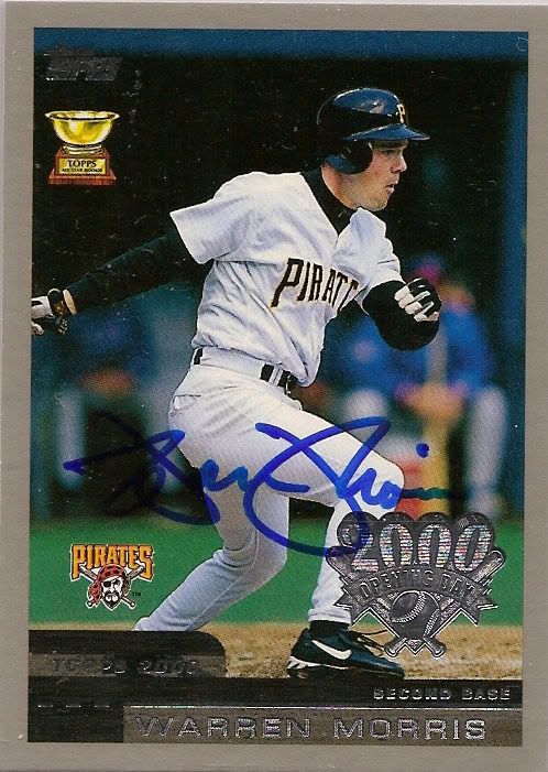
On a hot summer afternoon in 2000, my dad took a couple hours off work to pick me up and take me to a card shop on the other end of the city. One of his clients was having a Warren Morris in the store for a free autograph session. I brought along the two Morris cards I had duplicates of (for years the only cards I would get signed were ones I had doubles of). It was the first time I had met a professional athlete, and Morris could not have possibly been any more friendly. Granted, there were maybe a total of 8 people in the store, including Morris and the store owner. But that memory - great time spent with my dad, and catching the autograph bug, are memories that go a lot deeper than cardboard and ink.
4) 2005 Prime Patches Triple Logo Patch
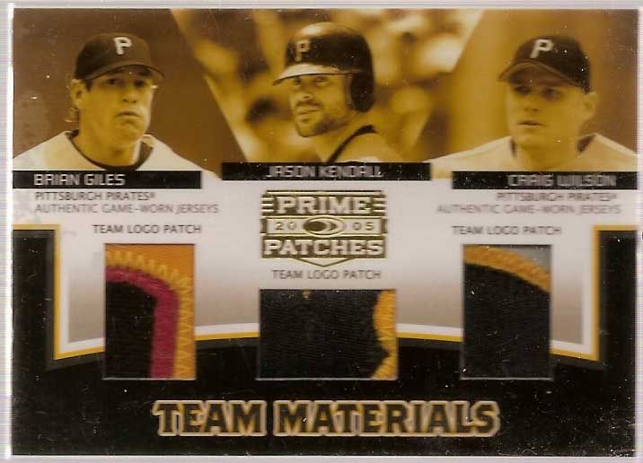
This is the card that made me join ebay. Or more accurately, annoy the hell out of my mother until she gave let me use her credit card to sign up for a paypal account and join ebay. I was obsessed with this card, and even though game used has lost its luster this is still one of my favorite cards.
3) 1991 Topps Dwight Smith
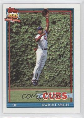
1991 Topps #463 - Dwight Smith
My first pack of cards came in 1991 when I remember going to the gas station with my dad. A trip for gas always means a slurpee. But for one reason or another my dad decided to get me a pack of cards as well. The top card of the pack was Dwight Smith's 1991 Topps card. Smith, with a slight leap set against the ivy backdrop of Wrigley. I knew nothing about baseball, the Cubs, or Wrigley field. I was probably more excited about the stick of gum. But I still have that card in a snapdown.
2) 2001 Donruss Elite Status /12
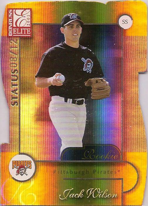
In the spring of 2001, I decided to start collecting a slick fielding shortstop who I was reading about in the newspaper. I had just gotten back into cards less than a year earlier, and was looking for a collecting focus. I remember going to card shows early in 2001 and asking if dealers had Jack Wilson cards. They didn't even know who he was. I had a bit of luck on my side - eight and a half seasons of fantastic play, memorable summers, and an all-star appearance. You can keep your Ichiros, Pujols', and Mark Prior(!) cards. 2001 was all about Jumpin Jack Flash for me. And there nothing beats a beautiful die cut rookie.
1) 2004 Fleer Hot Prospects Past, Present, Future Autographs /33
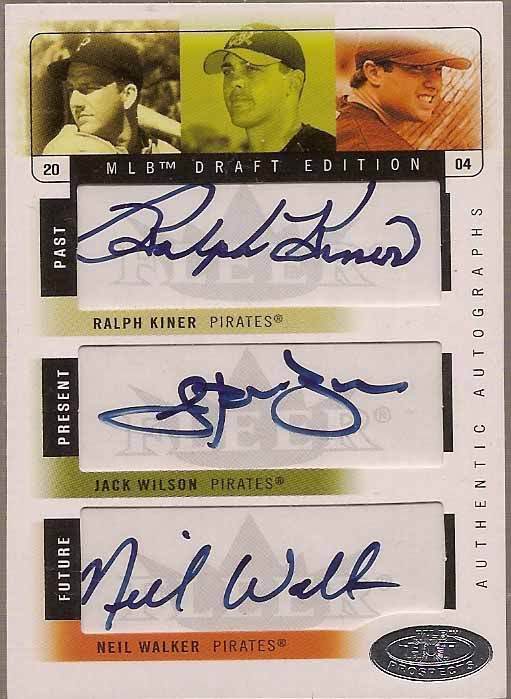
This card was my white whale for the longest time. My favorite player, paired with a Hall of Famer, and a local kid who was a first round pick? I think I finally landed a copy around 2006 or 2007, when it looked like Neil Walker was headed for a very lackluster career at best. Even then, I adored this card. The fact that he has bloomed into a really solid player just makes it that much sweeter.
I'm at a bit of a crossroads in my collecting life. The cards above still excite me every time I look at them. They're special pieces of my collection that are invaluable to me. They're also subtle reminders that I haven't added a card that I enjoyed this much and got this excited about in years. Maybe it's just me getting older, and maybe it's the changes to the hobby and staleness of Topps products. And the number of cards out there on my "must have" list that aren't Jack Wilsons is a very, very short list. Either way, I'm finding myself having more fun with Photoshop and a inkjet printer than I do chasing cards from the newest releases. I'll never stop collecting, but how and why I collect may look a lot different. I don't know. But here's to another 500 posts to figure it out.
Saturday, February 21, 2015
Another One From 1998 Donruss Signature
I've been slowly knocking off cards to inch closer to completing my 1998 Donruss Signature autograph set. It's one of the nicest auto sets out there for my money, and has the 90's nostalgia that I love.
This Darin Erstad auto is SP'd to 700, and one of the less common autos in the set. I was more than thrilled to grab it for less than $2.
Erstad is probably one of those players who are lost to time. He was an exceptional defender, and for a brief stretch one of the best hitters in the league. But in the offense packed 90's, there were too many players who put up bigger numbers for longer stretches. And I have to think Disney's use of sports franchise as marketing tools probably didn't do much for his overall exposure.
Friday, February 20, 2015
Pushing My Luck
I was pretty happy with my one pack break of 2015 Topps. I have a case break worth of Pirates headed my way, and there haven't been any real standout cards that I've seen, since Topps cropped the photos so tight this year leaving little room for awesome action shots. But Kate surprised me and picked up one of those retail jumbo packs at Target on her way to doller derby practice (a ploy to make me forget the insane amount of money she just spent on elbow and knee pads? Perhaps. But it worked).


I'm usually not one to tempt my luck on wax, and would rather just spend that money on COMC. But when there's a pack sitting right in front of you, it must be ripped!
A relic card? Out of a free hanging pack? Maybe the pack searchers took the day off.
The relic design actually looks pretty cool. I like it a lot more than the relics in the last couple years' releases.

A relic card? Out of a free hanging pack? Maybe the pack searchers took the day off.
The relic design actually looks pretty cool. I like it a lot more than the relics in the last couple years' releases.
I managed to beat the odds and pull 4 Pirate cards from the pack. Of course there will be more where that came from headed my way. Check out Pedro before he tries to assault some fan in the third row with the baseball. Hopefully he can do less damage at third base.
This Pudge card was by far my favorite of the pack.
And rounding things out was a cool photo of the Splendid Splinter.
Overall, I'm liking this set a lot more than I had expected when I saw the design. The base cards are unique, and the insert sets are absolutely killer. My only gripe (aside from the obnoxious effects applied to the photos) is the lack of Pirates in the insert sets. I swear Topps has something against Andrew McCutchen.
Thursday, February 19, 2015
Honey, I Shrunk the Cards
Throwback sets have been all the rage for Topps this millennium. So much so, that some of the throwback sets are almost old enough to have throwback sets. It's all a bit tedious if you ask me.
Not the concept. Just the execution. After Archives and Heritage his shelves in 2001, Topps went a step farther. The Topps 206 set(s) in 2002 were absolute gold in my eyes. They stayed true to the spirit of the set, and were the first introduction of the now wildly popular minis. And that formula worked for the majority of the other tobacco card sets - Turkey Red, Allen & Ginter, T-205, and even the obnoxious Gypsy Queen. Take an amazing, classic design that many collectors may not know about. Put modern players on it. Sell baseball cards.
I loved that. What I don't love is taking said set, and turning it into its own monster. Ginter's original design is clean, gorgeous, and classic. The set was a nod to the original series that features all kinds of off the wall stuff. But nearly a decade later...it looks nothing like the classic set. It's just a repeated trope, with a design that becomes less and less clean or classic every single year. But when you can basically print money ever year...why not.

Wednesday, February 18, 2015
Pitchers, Catchers, and Two More Inches of Snow
 Pitchers and catchers are trickling into warmer weather towns. But me? I got an extra couple inches of snow today, and the 10 day forecast has one day above freezing...when it will be in the high 30's and rainy.
But...baseball! And I decided an apt way to celebrate was to grab a pack of Topps while picking up some kitty litter today. I already have my Pirates coming in from a group break, but I've been fighting the temptation to crack a pack or two since release day. In fact, the only thing that stopped me was when I went to Target on the 4th, there wasn't any 2015 in sight. We live by the saddest looking Wal Mart and Target I have ever seen, which is saying a little something after living in West Virginia and Ohio.
But I finally scratched the itch. And while I'm not exactly jumping for joy, it was worth the $2.
So let me get this straight. I have probably 5 or 6 team sets of Pirates cards coming. And my first two cards of the pack are...Pirate cards? I'm not sure whether to call that good luck or bad. Fortunately Melancon and Watson are both good TTM signers, so those will be headed down to Spring Training to hopefully find their way back to me.

I don't know that I'm crazy about the design of this insert...something about it screams red light special to me. But it is nice to see Topps use a photo of Hammerin Hank that I can't remember seeing before. Of course that probably means it will be on 6 other cards this year.


Monday, February 16, 2015
Filling in the Gaps
 As a team collector, there is nothing that bothers me more than a player not having a card commemorating their time in Pittsburgh. For that relief pitcher who gets 3 innings in September, it's tolerable with gritted teeth. But anything more than that, and I want some cardboard! Especially when we have a Pirates Ben Grieve card out there.
But even in the era of 60 card sets per year, there were quite a few players who slipped through the cracks. There were probably a number of factors - both Fleer and Topps scaled back their flagship products significantly in the late 90's. Donruss was temporarily out of the game. Pacific actually put out pretty comprehensive sets, but they were the 4th wheel at a 3 seat party. So what do you do when the big companies didn't put out a card? Well, you make one yourself, of course.
Joe Oliver's tenure in Pittsburgh is one I'd rather not think about. The Pirates gave up on Jose Guillen way too early in exchange for a catcher on his last legs in the aftermath of Jason Kendall's nasty 4th of July ankle break. It's a time I'd rather not think about.
But Pete Schourek? Schourek made 17 starts for the Pirates in '99. Sure, they weren't good starts. But he was the team's 5th starter none the less. But in the days of a chopped base set and a '99 Pirates team set that barely acknowledged the team was indeed a part of major league baseball, ole Pete didn't stand a chance.

Friday, February 13, 2015
The Newest, and Oldest, Memorabilia in My Collection
Sometimes you stumble on some absolute gems. I was browsing ebay when I stumbled on an absolute gold mine. A run of team photos stretching from the early 40's through the late 70's.
I went back and forth on how many to bid on, which ones to bid on, and how much to bid. When the dust settled, I had 6 photos headed to my doorstep. They all appear to be originals, probably from some kind of baseball magazine of the day, since the back of each has typed stat ledgers or highlights blurbs. The bottom of each photo has the roster of who is included in each photo, but auto-crop wasn't cooperating.
So here are half of the goods, and my personal favorites.
1946

The real gem of this one? Top row, third from the right. Ralph Kiner during his rookie season. The Pirates were a pretty un-inspiring team after the likes of the Waners, Pie Traynor, etc faded off into the sunset. But Kiner would be a lone bright spot for some of the worst teams in franchise history. But what a bright spot he was.
I went back and forth on how many to bid on, which ones to bid on, and how much to bid. When the dust settled, I had 6 photos headed to my doorstep. They all appear to be originals, probably from some kind of baseball magazine of the day, since the back of each has typed stat ledgers or highlights blurbs. The bottom of each photo has the roster of who is included in each photo, but auto-crop wasn't cooperating.
So here are half of the goods, and my personal favorites.
1946
The real gem of this one? Top row, third from the right. Ralph Kiner during his rookie season. The Pirates were a pretty un-inspiring team after the likes of the Waners, Pie Traynor, etc faded off into the sunset. But Kiner would be a lone bright spot for some of the worst teams in franchise history. But what a bright spot he was.
1971

This photo is exceptionally clear compared to the others. But I guess 30 years of printing advancements will do that. Gotta love the soon to be World Champs taking their team photo as some early goers trickle into Three Rivers.
1947

This one is my personal favorite of the group I won. It features two really unique occurrences in Pirates history. First up, check out the jerseys. The script Pittsburgh font would appear for only the 1947 season. It wouldn't be seen again on a Pirates jersey until the early 90's. This year also features two of the games greatest sluggers - Ralph Kiner in his second season in the majors, and an aged Hank Greenberg, who would wrap up his career with a 25 HR campaign with the Pirates at age 36.
This year - one that isn't particularly spectacular in any real fashion - has always been something that has interested me. You have what to this day remain two of the greatest power hitters in major league history on one team - one on the upswing and the other in the twilight of his career. I look at the season as a bit of a bridge between the blue and red schemed Pirates Honus Wagner led teams of the early century and the black and gold club we know today.
Thursday, February 12, 2015
An Autograph a Day
We're finally getting down to the home stretch here. It took a little (a lot) longer than expected, but I've finally gotten around to showing off most of my autographs from the past few months.
Of course the downside is that now I have an entire new stack of mail that came in.
David Bell is always a guy that I considered sort of a head scratcher. He had a 12 year career, and racked up over 1200 hits. And while he had a short career power surge, he was never the kind of guy who had power that you would associate with a corner infield spot.
But decent offensive numbers, solid defense, and low strikeout totals were enough to keep him in the league quite a while.

Wednesday, February 11, 2015
I Prefer My Jerseys Used
It's been a while since I've added a new Pirates game used jersey to my collection. My goal is to get one of every style worn by the team, but since the team partnered with Hunt auctions prices have gone through the roof. I imagine the majority of these jerseys are being put up in a dentists office or basement with a very expensive pool table, and will reappear on the secondary market once the player leaves the Bucs. And when nobody wants to pay $400 for that jersey that is worth closer to $100...
But I digress. In the past, I've shown off my 1979 era throwback jerseys - a black Daniel McCutchen and pinstriped Ronny Cedeno. But of course the crown jewel of the trio is the gold jersey, which was both the most commonly worn jersey during the Bumblebee days, and the most frequently worn as a throwback. I had my eye on a Ruben Mateo years ago, but didn't pull the trigger. I've been kicking myself ever since.
And then this beauty showed up in my ebay searching.
Better yet the auction ended for just over $50. It is by far the lowest I've paid for a TBTC jersey, and I think almost half what the Cedeno went for.

The jersey was listed as a 2010 and game issued, a year that Pearce had only a handful of plate appearances. But that didn't seem right, since I didn't remember the Pirates wearing that style in 2010. After plugging in the MLB holo number, it confirmed my suspicion that the jersey was from a 2009 TBTC night.
Pearce started at first base, going 1 for 4 in the game. Not exactly extensive wear, but it's about the best you can hope for with a one-off jersey.
Better yet, I have a pretty cool photo from the game featuring Pearce and our old friend Lastings Milledge.

Pearce started at first base, going 1 for 4 in the game. Not exactly extensive wear, but it's about the best you can hope for with a one-off jersey.
Better yet, I have a pretty cool photo from the game featuring Pearce and our old friend Lastings Milledge.
I'm still waiting for the day when I can properly display my game used jerseys, but in the mean time this finishes off my Bumblebee trio with one of my favorite Buccos who never quite made it work in Pittsburgh.
Tuesday, February 10, 2015
A Few Backlogged Pickups

I think the Johnson and Dickey were a quarter each, while the Hamilton and Smoltz were a mere dime.
While I'm usually pretty focused on tracking down Pirate cards at shows, it's always nice to find a plan B when Buccos are few and far between. This mall show was just that - a bunch of grab bag, junk, and overpriced stuff. The only two "real" dealers didn't offer much more. One guy had nothing but hockey - I did scoop up a few cool Lemieux base cards from his dime box - and the other guy was one of those "pick out what you like and I'll give you a price" guys.
Normally this doesn't end well.

But Kate was off shopping in the mall, my phone was dead, and I had nothing but time to kill until she got back. Once I had settled on a few cards of interest, I asked for his price. I was expecting it to be more than I wanted to pay, but obviously the price was great.
I think that may have had something to do with the grown man catfight that had happened earlier when another buyer had walked away from an 800 card purchase. The guy had asked for a price, and the dealer apparently had a brain fart (or just wasn't great at 9th grade math) and told him $3 on the 300 card pile of Bowman parallels and Topps Red foils. The guy then picked up another 500 cards, hoping to pay $8 for the bunch. Apparently the cards were supposed to be 3/$1 (still a good deal in my eyes), and the dealer apparently learned to add by that point.
The buyer insisted all the cards should be priced at the first quoted rate. The dealer offered to give him the first 300 for $3 and then the 3/$1 price for the rest. And the ensuing 5 minutes of grown men staring at each other over baseball cards was priceless.

This hobby is full of cheats, weirdos, and people looking to make a quick buck. It just comes with the territory, if you've been around the hobby long enough, and you just sort of have to learn to avoid it as best you can. But sometimes...boy do I wish I took up scrapbooking. Or knitting. Or something were maybe, just maybe, the people are a little less...unique.

Monday, February 9, 2015
Making My Own Autographs
Yesterday I posted my trial run at repurposing an autograph sticker. Well, that was all just a warmup for the project I really wanted for my collection.
The 2013 season was a really special one for me. I started the season watching Pirate games on mlb.tv in our apartment in Lima, Ohio, 5 hours from home, family, and PNC Park. I ended the season inside PNC Park, watching the most exciting baseball I have ever seen. You probably know all the rest - playoff drought, Blackout, Cueto, etc.
I know Topps has been fickle in recent years, but I felt like there was a good chance that there would be at least one or two awesome Pirate cards commemorating their playoff run. Maybe a Highlights card in Heritage, or a playoff recap card in Flagship.
Or...not. Topps did put out an awesome looking 2013 Postseason set of game used, autos, and combo cards. Pedro Alvarez has a patch card, and Andrew McCutchen has a jersey relic. And I managed to get outbid or forgot to bid on every single copy I saw. So those remain as two of my remaining grail cards.
But I was a little disappointed that Pirate postseason heroes like Russell Martin and Marlon Byrd were left out of the set in favor of star power.

Well, disappointment over. With a little arts and crafts time this weekend, I think I just found one of my favorite pieces in my collection. Martin's home run during the Wild Card game sent PNC Park absolutely nuts. His excitement and intensity through the stretch run were awesome to watch, and I think this photo captures that perfectly.
I actually bought the sticker during COMC's end of year sales. It started out as one of the really, really ugly SP Signature cards.
![2012 SP Signature Collection [Autographed] #NYY 14 - Russell Martin - Courtesy of COMC.com](https://img.comc.com/i/Baseball/2012/SP-Signature-Collection-Autographed/NYY-14/Russell-Martin.jpg?id=8216bddd-7684-4588-811e-c1726e22878c&size=original)
2012 SP Signature Collection [Autographed] #NYY 14 - Russell Martin
The 2013 season was a really special one for me. I started the season watching Pirate games on mlb.tv in our apartment in Lima, Ohio, 5 hours from home, family, and PNC Park. I ended the season inside PNC Park, watching the most exciting baseball I have ever seen. You probably know all the rest - playoff drought, Blackout, Cueto, etc.
I know Topps has been fickle in recent years, but I felt like there was a good chance that there would be at least one or two awesome Pirate cards commemorating their playoff run. Maybe a Highlights card in Heritage, or a playoff recap card in Flagship.
Or...not. Topps did put out an awesome looking 2013 Postseason set of game used, autos, and combo cards. Pedro Alvarez has a patch card, and Andrew McCutchen has a jersey relic. And I managed to get outbid or forgot to bid on every single copy I saw. So those remain as two of my remaining grail cards.
But I was a little disappointed that Pirate postseason heroes like Russell Martin and Marlon Byrd were left out of the set in favor of star power.
I actually bought the sticker during COMC's end of year sales. It started out as one of the really, really ugly SP Signature cards.
2012 SP Signature Collection [Autographed] #NYY 14 - Russell Martin
I had the idea of repurposing the sticker at the time, but had no idea what I would stick it to. Maybe a 2013 base card? Would I dare to make a custom? When I saw some of the Postseason cards coming out of 2015 Topps (the Pirates were entirely excluded this year), I figured it was time to see if I could whip up the 2014 design.
And that great white space to the left of the card was just screaming for an autograph.
This card was actually a lot more stress and difficulty than the Lough auto I posted yesterday. The Panini sticker came right off, while UD's sticker was...well, sticky. I was so frazzled from getting the sticker off cleanly that my first attempt actually ended up in the trash. In my haste to get the sticker onto the card, I placed it right below the bottom of the postseason logo. It ended up looking off balance, and covered up the postseason patch on Martin's arm.
Luckily I was able to print another copy and loosen the sticker before the adhesive fully dried. I'm a lot happier with this copy, and love the way this turned out. I'm hoping between stickers and some TTM autographs, I might be able to create a set for the majority of the playoff roster.
If anybody has any extra sticker autos of any of the Pirates from the 2013 team, I'd be happy to trade for them.
Sunday, February 8, 2015
When card companies give you ugly autographs, make...lemonade?
I've been posting some of my custom card creations on here for a while. It's been fun playing around with designs, and over the last few weeks I come up with a process for printing the cards that (at least in my estimation) gives them the look and feel of the real thing. I have a bunch of customs out in the mail, so hopefully some signed ones will be back soon.
Customs are a great resource for a team collector like myself. Let's face it - Topps has gotten pretty lazy in their checklists over the years once you get beyond the top names. And minor contributors like Felix Pie or Ruben Mateo are pretty unlikely to get a card during their brief Pirate tenure even under the best of circumstances. But even if you whip up a custom card, getting autographs from some of those players? Good luck.
But I realized I might find an actual use for those pesky sticker autos that collectors despise so much. During the COMC holiday sales last year, I picked up a few cheap autos of ex-Pirates who didn't have a certified auto in black and gold. And after a few months of stalling, I was ready to finally take the plunge this weekend.
Almost. I figured I needed a trial run before taking the risk of butchering one of my prized autos for my collection. And the auto of David Lough I pulled from a box of 2013 Pinnacle recently seemed like the perfect sacrificial lamb.
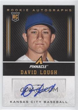
2013 Panini Pinnacle Rookie Autographs #DL - David Lough
The card was...well, it was pretty ugly. I had no idea who Lough was, so I was a little surprised to see he had logged almost 200 ab's with the Orioles this past year, a team I watched pretty often on mlb.tv. So an O's card it would be. I found a great photo from a game where the O's wore Baltimore Black Sox uniforms, one of the city's Negro League clubs.
I decided on a 1990 Donruss design. The border is black and orange, but it comes up looking more red in the scan. I swear it's orange in person.
 The sticker auto actually came off of the Panini card pretty easily, and in no time was affixed to its new home.

Customs are a great resource for a team collector like myself. Let's face it - Topps has gotten pretty lazy in their checklists over the years once you get beyond the top names. And minor contributors like Felix Pie or Ruben Mateo are pretty unlikely to get a card during their brief Pirate tenure even under the best of circumstances. But even if you whip up a custom card, getting autographs from some of those players? Good luck.
But I realized I might find an actual use for those pesky sticker autos that collectors despise so much. During the COMC holiday sales last year, I picked up a few cheap autos of ex-Pirates who didn't have a certified auto in black and gold. And after a few months of stalling, I was ready to finally take the plunge this weekend.
Almost. I figured I needed a trial run before taking the risk of butchering one of my prized autos for my collection. And the auto of David Lough I pulled from a box of 2013 Pinnacle recently seemed like the perfect sacrificial lamb.
2013 Panini Pinnacle Rookie Autographs #DL - David Lough
The card was...well, it was pretty ugly. I had no idea who Lough was, so I was a little surprised to see he had logged almost 200 ab's with the Orioles this past year, a team I watched pretty often on mlb.tv. So an O's card it would be. I found a great photo from a game where the O's wore Baltimore Black Sox uniforms, one of the city's Negro League clubs.
I decided on a 1990 Donruss design. The border is black and orange, but it comes up looking more red in the scan. I swear it's orange in person.
The Panini card, meanwhile, just looks naked now. And with a trial run out of the way, I'll be attempting to work my magic with some Pirate cards.
Friday, February 6, 2015
Spring Fever
It's been really, really cold around here the last couple days. But we're getting closer to pitchers and catchers reporting. Which mean the great thaw is on the way. And while I've been a little burnt out on cardboard lately, I've been having a blast with some photo paper, card stock, and a computer.
One of my collecting friends lives in Arizona, and is right across the street from the White Sox spring training complex. So we're teaming up to get some autographs for another friend who is a Sox collector. I've been tossing together some customs for her to get signed.

It's been really fun to play around with different designs and techniques. Better yet, as much as I've been griping lately about the products coming from manufacturers customs provide complete control over everything from the photo to the design. I've been making some of my own custom designs, but for these I've been using (or tweaking) some designs that my White Sox buddy likes best.

As I've grown a little more confident with my Photoshop skill set, I decided to finally take the plunge. I ordered some more high tech supplies to make more complex (read: shiny) cards. So that should be some fun arts and crafts time in the coming weeks.
One of my collecting friends lives in Arizona, and is right across the street from the White Sox spring training complex. So we're teaming up to get some autographs for another friend who is a Sox collector. I've been tossing together some customs for her to get signed.
It's been really fun to play around with different designs and techniques. Better yet, as much as I've been griping lately about the products coming from manufacturers customs provide complete control over everything from the photo to the design. I've been making some of my own custom designs, but for these I've been using (or tweaking) some designs that my White Sox buddy likes best.
As I've grown a little more confident with my Photoshop skill set, I decided to finally take the plunge. I ordered some more high tech supplies to make more complex (read: shiny) cards. So that should be some fun arts and crafts time in the coming weeks.
Subscribe to:
Posts (Atom)