 I've been writing (read: complaining) a lot lately about my general disinterest in cardboard lately. And I'm taking the best and time tested advice of just scaling back for a bit. But...sometimes those pesky bookmarks have a mind of their own and just take me to a baseball card site. Damn computers!
I was pretty excited when I saw a preview gallery for 2015 Donruss baseball. Donruss was always my go-to flagship product. In my T-Ball league, I won boxes of 1993 Donruss Series 1 and 2 as part of some kind of end of year awards banquet raffle. I remember my parents' keeping the boxes in their closet for a year or two, convinced that baseball cards would still some day be worth a fortune, before I finally begged and pleaded enough for them to let me crack the packs. And I was hooked. A few years later, my dad took me to a card shop and bought me a (presumably overpriced) factory set of 1990 Donruss.
Topps always just felt very bland, safe. Fleer's cards, at least on the baseball side, always felt a little too crazy for my taste. Yellow borders? That obnoxious gloss free paper in 96 and 97? And Upper Deck just always felt smug and overpriced to my 9 year old eyes, years and years before I knew the shady dealings doing on in California. But Donruss? Their cards were fun. Cool designs, nice looking inserts, and plenty of star players to be found.
When Donruss came back in 2001, I bought up just about every pack in the area I could find, and am (slowly) working on a master set.
And while I didn't rip any packs of last year's product, it was a favorite among my group of team collectors for group breaks.
So 2015, sign me up!
...and then I clicked the link.
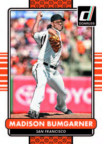
Wait, huh? The base design is actually not bad - colorful, but still featuring a nice photo. But...that photo. Panini, like Topps, has been on a "we just got our first copy of photoshop" kick for a few years, using any and all combinations of filters to alter photos, making cards look like something more out of the movie 300 than a baseball field. And now, it's made its way to the flagship product. You'll notice filters have been applied to make the background more pixellated, and also to enhance the contrast on the lines on MadBum's body. The result? It looks more like an actor in front of a green screen circa 1983 than a photo of a real, live baseball game.
But we were just getting started.
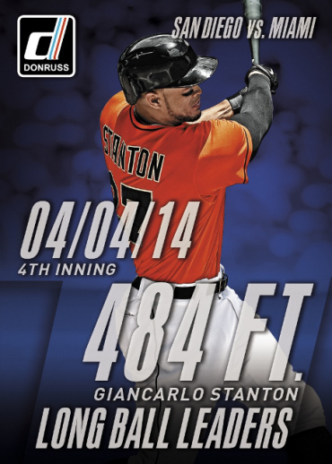
These cards do have backs, right? Let's take a look at what is on this card. Date. Inning. Opponent. Distance. Set name. Player name. and of all those, why is the player's freaking name the smallest font on the card? Can't some...any! of that information go on the back of the card? I know, I know, nobody reads card backs anymore. Well, this solves that. Just put everything on the front! And unless there is some really awesome foil added to this card (fingers crossed), it literally looks like something a middle schooler could whip up in 10 minutes.
But my heart wasn't done breaking yet.
But my heart wasn't done breaking yet.
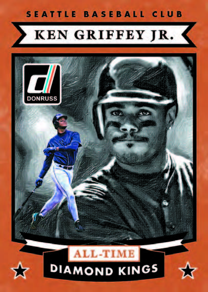
In 2001, the All-Time Diamond Kings set was part of what made me fall in love with Donruss. The set featured beautifully painted artwork on a card that only accented it. They were some of the cleanest, most compelling cards I've seen. And this? Fine, you won't pay for real art. Budget cutbacks, needed money for the vending machine, whatever. I don't like it, but...instead, you decide to just apply a filter to a picture, and pretend like that's kind of close enough? Oh, hey...let's stick a little cutout on these too, so it looks really artsy. But apparently so much time was spent on applying these time consuming photoshop effects (which do take at least 30 seconds) that any kind of design to the border didn't fit into the time constraints. I'm not bitter. Nah.
And I guess that's my point. Where is the care and effort put into sets? I don't mean how many different guys did you get to sign for your product. I mean are these baseball cards that I will look at and think - Wow, that's just an awesome looking card. The hobby has changed. The collector base has changed. The business of sports has changed. I get that. But for better or worse, what hasn't changed is what I want from a baseball card product. I want good looking, fun cards of my favorite baseball players. I want a card where it feels like care was made with the photo selection, rather than just picking one of 5 stock photos that have been repeated and cropped in different ways for the past 4 years. So I guess when I say I'm losing interest in cardboard, I really mean I've lost patience with year after year after year of product that don't really offer me the things I want to collect. And yeah, sure there are years and years of products to collect and chase that did offer the things I enjoy collecting. But it's not that hard to imagine some bizarro world where the hobby changed just a little less, or a little differently, and 2015 Donruss is an amazing set that makes me want to go out and buy a whole case, rather than go flip through my 2001 binder.
And I guess that's my point. Where is the care and effort put into sets? I don't mean how many different guys did you get to sign for your product. I mean are these baseball cards that I will look at and think - Wow, that's just an awesome looking card. The hobby has changed. The collector base has changed. The business of sports has changed. I get that. But for better or worse, what hasn't changed is what I want from a baseball card product. I want good looking, fun cards of my favorite baseball players. I want a card where it feels like care was made with the photo selection, rather than just picking one of 5 stock photos that have been repeated and cropped in different ways for the past 4 years. So I guess when I say I'm losing interest in cardboard, I really mean I've lost patience with year after year after year of product that don't really offer me the things I want to collect. And yeah, sure there are years and years of products to collect and chase that did offer the things I enjoy collecting. But it's not that hard to imagine some bizarro world where the hobby changed just a little less, or a little differently, and 2015 Donruss is an amazing set that makes me want to go out and buy a whole case, rather than go flip through my 2001 binder.


Amen. Needed to be said and you did it with flair.
ReplyDeleteFor the first time in five years I didn't put together a set from packs in 2014. If I don't find a set that catches my eye this year I'll sit on the sidelines again. I almost did Stadium Club last year, but I got my fill of that product through the blogosphere. Good reading and it saved me a couple hundred bucks.
I'm glad I'm not the only one feeling this way. It just doesn't seem like companies put much thought or effort into design in recent years. The cards I've enjoyed most - Stadium Club, Tek, some of the reprint inserts - are all either using a recycled design or tweaking one.
DeleteI know I can always go back and collect the "old" stuff, but even then that grows old after a while. It's just a strange feeling to realize that this hobby I've loved for 20+ years doesn't really offer anything on the market that really fits what I enjoy.