But the damn things are fun...
I'll be ranking the Topps Pirate team sets. The judgments are admittedly beyond subjective. Certain rankings may be driven entirely by sentiment, with utter disregard to anything having to do with the actual cards themselves. The rankings have nothing to do with the set as a whole - I'm focusing exclusively on the Buccos in the set, so my own rankings on a "full set" list would probably be entirely different. But hey, I said these things were subjective didn't I?
These type of things are always great to debate, and I'd love to hear from other team collectors (or anyone else for that matter) how my rankings would match up with the order for your team.
62) 1988 Topps

61) 2006 Topps
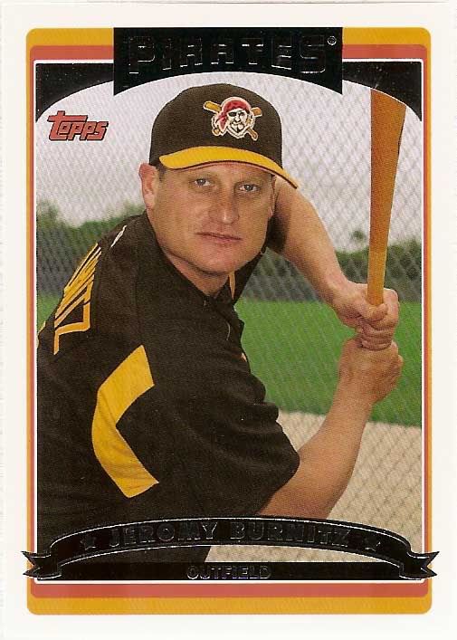
Topps decided that my fond memories were best not memorialized in cardboard, though. The 2006 set is just atrocious. The design is actually decent, though perhaps an acquired taste. But it's spring training jerseys galore. Take a look at this Jeromy Burnitz card. Photo cropped too close. Awkward batting post. Horrible armpit stripes. Beautiful chain link fence backdrop.
Ok, now keep in mind this card was in series two. Giving Topps a few full months of baseball to...do anything. Anything. The cards that do feature game photos all feature the Pirates pinstriped home Sunday alternates, presumably coming from one or two games. The late 2000's marked a real decline in photo quality for Topps. So of course the most logical thing to do was to give them an exclusive license.
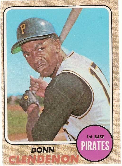
60) 1968 Topps
59) 1999 Topps
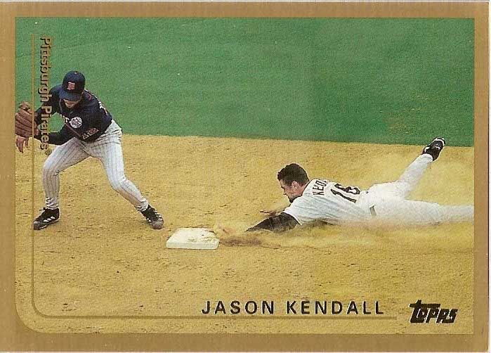
You know Topps, it didn't have to be like this. This photo is perhaps the best you'll see in this entire countdown. Interleague game from the first season of interleague play in 1998? Awesome. Jason Kendall sliding in to second hard? Sweet. The sweeping gold border even works pretty well on this shot. Hell, the team set is full of great action shots, as if said "hey, go grab that stack of photos we aren't using for Stadium Club."
So why so low? There are a whopping ten Pirate cards in both series. Ten. 1-0. You know, when you ask your little cousin how old he is and he holds up both hands? Yeah, imagine one card on each finger. Then take down four fingers on each hand, the outermost two on each side. See where this is going? That's exactly what Topps said to Pirate fans in 1999.
58) 1977 Topps
There isn't much to say about the 1977 set, because there isn't much happening in the '77 set. It's too similar to the superior 1974 set. But with an awkward waving pennant in the top corner. What happened? Did cookie monster take a bite out of it?
57) 1966 Topps

56) 2010 Topps
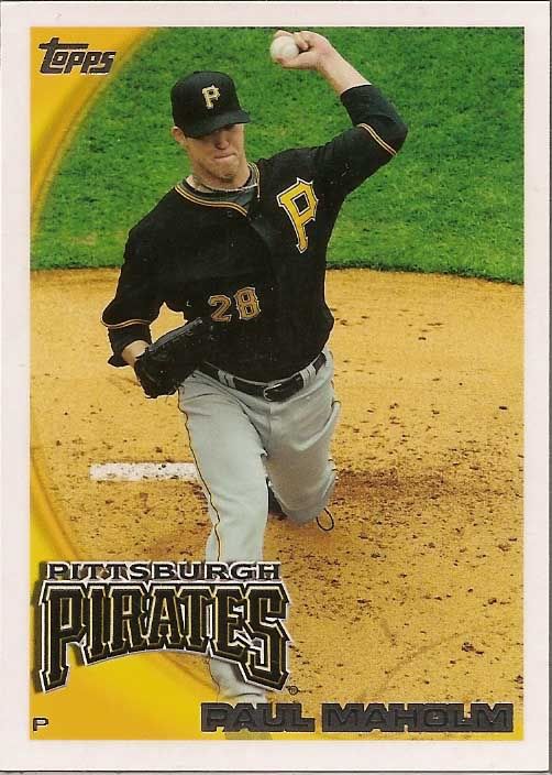
Did I mention blah? 2010 was a rough year for the Bucs, and the set is highlighted by such standouts as Andy LaRoche, Lastings Milledge, and Steve Pearce. This was only the third year of the ongoing run of white bordered monstrosities that I think we'll all remember as the Dark Ages. The logo and left side color splash overwhelms the card, a tidal wave ready to sweep over the photo. The team font (not even a logo!) seems awkwardly thrown onto the card, while the position is dwarfed, cowering in the corner for its life. The only thing saving this set is the inclusion of some nice action shots, including this Paul Maholm featured above. I believe this is also the only shot of the Pirates black alternate jersey for a few years to come.
At least 1999 had a traded set with four additional cards (including a Brian Giles)... 1996 had a whopping eleven. My problem with the 1977 set is they missed Goose Gossage.
ReplyDelete