 Maybe it's just me, but I don't think I'm ever NOT behind on scanning. Every time I get caught up, there's a card show or package coming in that makes the stack magically reappear in front of the scanner. My fiancee is monopolizing the scanner today scanning old family photos, so some pictures of my latest additions will have to wait.
 Since we moved from Pittsburgh to western Ohio, I've found myself yet again expanding my collecting interests. At home, Pens and Steelers cards were typically too overpriced to even consider, often being priced at 1.5-2x ebay prices at local shows. Fortunately one of the few perks of the move has been an ability to add lots of Penguins and Steelers cards to my collection at great prices. Not only has it given me something else to look for at shows, but it's also a nice little reminder of home each time I pull a card in the familiar black and gold.
One of the (perhaps few) perks to being a Pirates collector is , oddly enough, the team's colors The Pirates losing streak just so happened to coincide with pretty much every recent development in modern cards, meaning Pirates players were almost entirely excluded from most of the fantastic insert sets of the 90's and early 2000's, and have had comparatively fewer cards in most base sets than their Pittsburgh counterparts in hockey and football.
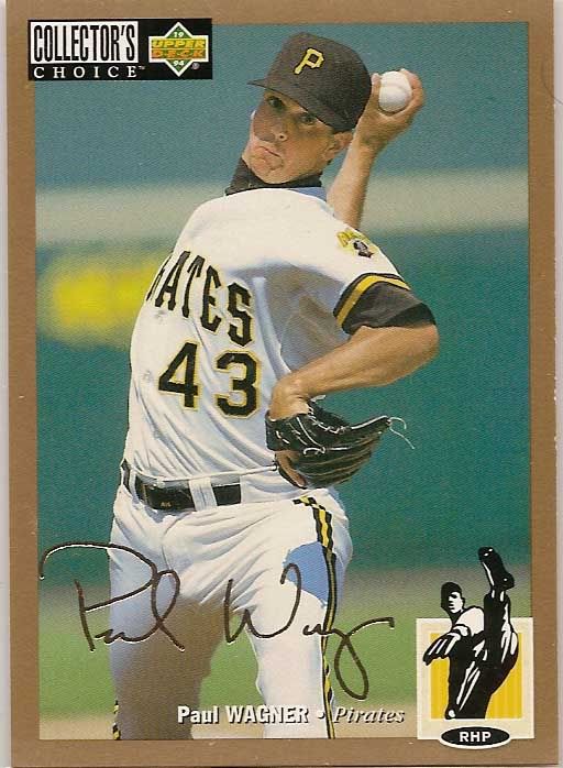
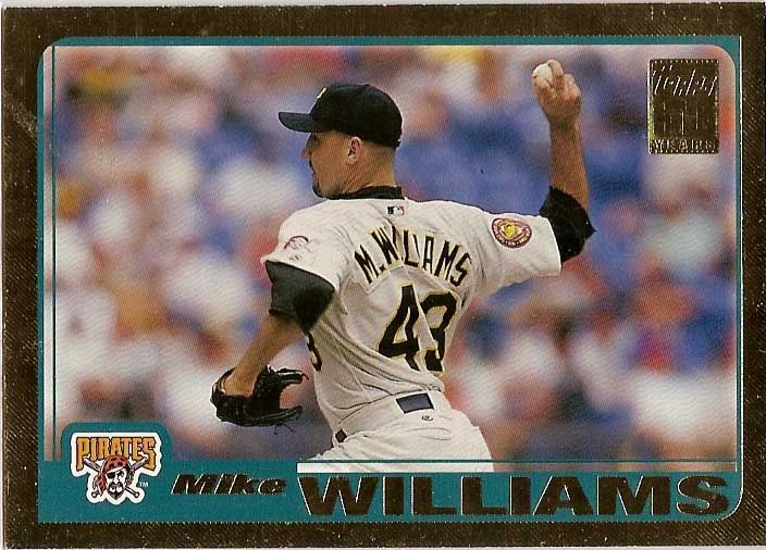
But the team's primary colors of black and gold also happen to be two of the most common colors used in parallel sets. From Collector's Choice Gold Signature cards parllels in the mid 90's to the popular Topps Black and Chrome Gold Refractors today, the colored borders really make the team's uniform colors 'pop' in my opinion.
Pittsburgh's teams are of course unique for their color parity across all major sports, though the Penguins have shifted to a more muted Vegas Gold in recent years. The Steelers are the only team in the city to maintain a singular color scheme throughout their history - the Pirates changed from a blue and red color scheme to the now familiar black and gold before the 1948 season, and the Penguins used a number of blue and white color combinations before switching over after the city's other two teams won their respective championships in the 1979 season.
Since the Pirate uniforms prominently display black,with a more subtle gold piping, I think the gold borders accentuate the secondary color.
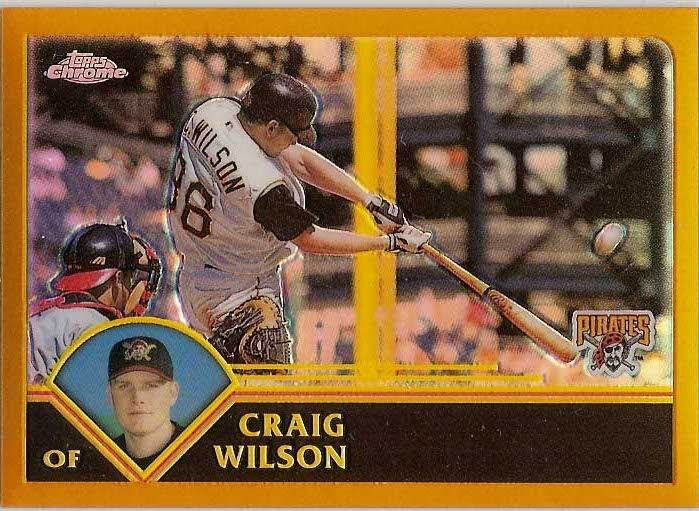
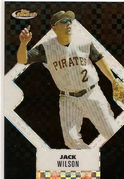
The 2003 Topps team set has some great action photography prominently featuring PNC Park, including this Craig Wilson card. As an added bonus, the yellow of the foul pole really seems to bring this card together. And capping off the color theme and players who's last name begins with a W, these two Jack Wilson refractors illustrate my point about the black on black color scheme. While they both look good, the inclusion of the gold on the 2005 Topps Chrome refractor stands out more to me than the black-heavy 2006 Finest ref. I would love to see the Pirates reintegrate a gold jersey into their uniform set at some point.


I hear you about the inflated prices here in western PA. The monthly show I attend in Hermitage is a good example of that.
ReplyDeleteMakes it easier for me though to find cheaper cards of my teams...
Love the blog, keep up the good work