Showing posts with label uniforms. Show all posts

Friday, May 9, 2014

I'm Goin Goin, Back Back, to Ohio Ohio

Some places just feel like home.  Every time I get through the tunnels and see Pittsburgh's skyline in front of me, I feel at ease - even if I am driving into a traffic accident waiting to happen every time.  When I stop to see my parents, turning into the housing plan is and forever will be home.  And even though I only spent two years there, crossing the state line into West Virginia a few miles outside Moragntown always necessitates a hearty acapella rendition of Country Roads being belted out in my car. 

And then there's Ohio.  Oh, Ohio.  The state that bored me into finally starting a blog. 

Last Friday Kate and I both had the day off, and decided to bravely return to our last state of residence to hit a flea market in Rogers, OH.  The flea market is a Friday only deal nestled in the middle of nowhere a few miles from the PA state line.  But it's one of the largest flea markets in the country, and we were in the mood for a trip.

The drive for an hour and a half on winding two lane highways and back roads made for some interesting sightseeing.  Some of the more interesting sights?  Santa on the side of the road and a two story gold bodybuilder statue.  The weather was decent, but the flea market was pretty dead.  Guess I should have expected that this early in the season.

After walking around for a few hours, our purchases were few and far between.  But I didn't come home empty handed.  I found one vendor with some cards - lots of overprices star commons at half book price.  But the 8/$1 box yielded a few cards worth bringing home.  The first thing that caught my eye was a small run of Kellogg's 3D cards.  For whatever reason they've always been tough to find around here, so the small stack instantly started my pile.  No Buccos, but I found a few 70's stars who will be heading out to fellow bloggers one of these days.

I reeeeeally need to get myself a teal Mariners jersey one of these days.  Gotta love the Big Unit.

 And of course I was able to dig up a few cards for my main collections.  I always love adding minor league cards, and one of my biggest (of many) complaints about the Topps monopoly is the lack of minor league releases these days.

 Bronson Arroyo wasn't in the Pirates organization all that long, but it's nice to see his familiar leg kick was still gracing cardboard two years before his big league debut.

 And of course no trip would be complete without some new cards for my Kordell Stewart collection.  There are just so many cool 90's Slash cards out there.  It's a little hard to see from the scan, but the top card features X-Man Wolverine in the background.  Perhaps not the most logical superhero pairing, but an awesome card nonetheless.
 And I'll always have a sweet spot for cards from early in his career that feature Kordell as a receiver.  At this stage my Slash collection is probably one of my favorites to add to, with so many awesome cards still out there to chase.
 Overall, not a bad haul for $2.  Overall the trip was a bit of a bust, but I did manage to find a few other cool pieces that I'll hopefully post later on.  Flea markets are always a roll of the dice, but it made for a fun, and cheap, Friday trip.

Tuesday, April 9, 2013

Throwback Tuesday

The throwback uniform knows no bounds.  Literally.

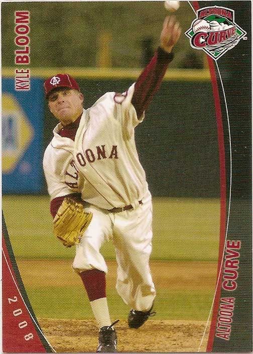
The Altoona Curve franchise has only been around for 15 years, all of which have been affiliated with the Bucs.  But for their 10th anniversary, the team felt the need to have some spiffy throwback unis.  Tough to do when you don't actually have anything to throw back to, right?

But the club, known for their creativity in the marketing department (a sharp distinction from their parent club), couldn't be bound by the constraints of space and time.  Instead, they created 1920's era throwback uniforms for a club that wouldn't be birthed until the end of the century.

All kidding aside, I really like the look.  One-time Rule 5 draftee Kyle Bloom models the jersey nicely, displaying the re-imagined logo, cream colored jersey, font, and arm patch.

I think the uni draws well upon the town's railroad heritage, while still holding true to the spirit and style of the era's minimalistic jersey designs.  And as you can see in the top right corner, the "throwback" jersey and logo makes for a significant upgrade over their logo at the time.

Tuesday, April 2, 2013

The Day After


Opeing Day came and went, and in typical Pirate fashion A.J. Burnett pitched well, but the offense just did not hit. Thanks to mlb.tv, I've been able to watch quite a bit of baseball over the last couple days, and I'm absolutely loving it as I sit here watching Yu Darvish pitch a (thus far) perfect game as I type.

I'm quickly accepting that I'm terrible at this blogging thing when it comes to scanning.  I'm still working my way through cropping scans from purchases and show pickups from a month ago as I prepare for the monthly show in Dayton this weekend, and imcoming COMC spring cleaning special shipment, and an absolutely mindblowing lot I snagged off ebay.

As I sit here watching that which shall not be named, I noticed that one thing the Pirates have been sorely lacking in is "memorable moment" cards.  I love cards that commemorate a special moment or event, whether it's postseason highlights, career milestones, or individual achievements.  Unfortunately, there haven't been many of those in recent Pirate history.


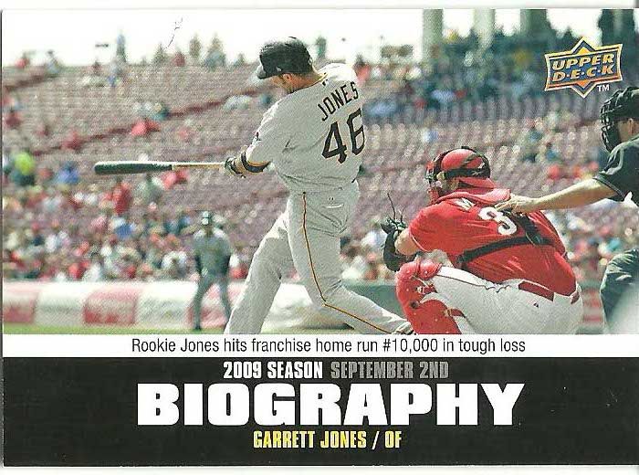
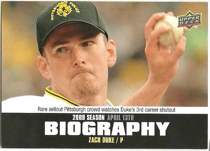
I loved the 2010 UD Season Biography cards, since they featured actual game photos from the game discussed and covered a more broad range of highlights than the typical season highlights fare.

Both moments are ones that I recall from an otherwise very forgettable 2009 campaign.  Jones came out f nowhere as a non-roster invitee to earn the nickname The Legend, providing power to a team desperately lacking in it.


The Duke game was more memorable to me for the unique hats than for Duke's shutout, as the Pirates commemorated a trio of officers who died on the job.  I love (and cringe at) the caption noting the "rare sellout crowd."  I can't remember the specific details of the game - it wasn't a bobblehead game, and was probably too early in the year for a skyblast night - but I'm sure some kind of added incentive was involved to draw such a large crowd.  Until recently, sellout crowds were a rare sight in Pittsburgh.  

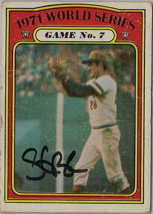
And of course I don't think I need to say much about these final two.


Sunday, March 10, 2013

Turn Back the Clock(s)

Since we all turned back the clocks today, here are a few cards doing the same.

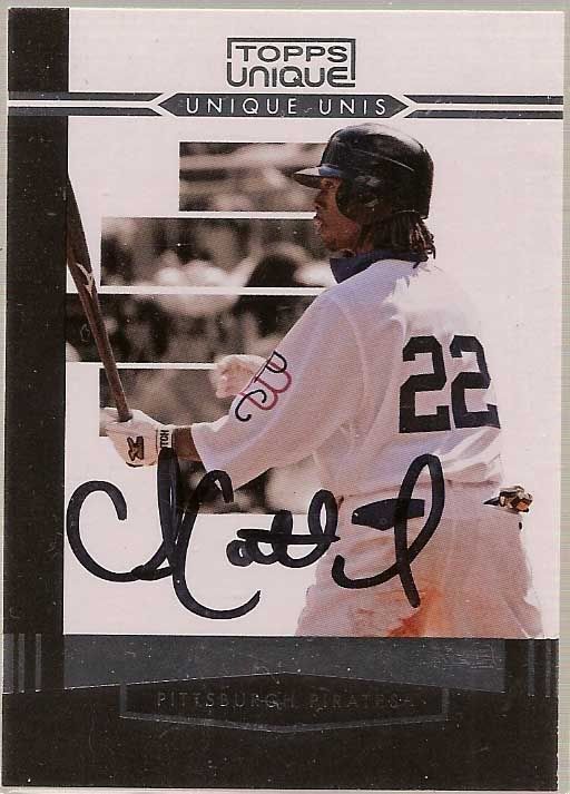
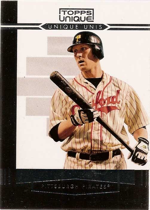
Topps Unique was an all-around unremarkable set that only lasted one year.  It was released late in the season, and was probably completely forgotten by most collectors soon after.  But it also includes one of my favorite insert sets: Unique Unis.

The set includes quite a few gems, including this photo from Andrew McCutcuen's rookie year in vintage 1909 uniforms.  Topps used a few photos from this game for cards, including Delwyn Young's Topps Update card and McCutchen's card in Topps Ticket to Stardom.
Though he was in Boston by the set's release, I believe this is the only card to date featuring the Pirates in Pittsburgh Crawfords NNL unis.  A great card paying tribute to an important piece of baseball history.


And finally, the Steelers get in on the uni action as well.  The Steelers wore these retro uniforms as third jersey alternates for a few seasons.  I really liked the gold helmet/black jersey combo, and hope the team continues to work in more throwback jerseys in future seasons.

Tuesday, March 5, 2013

Throwback Tuesday

In case it hasn't been made clear yet, I have a bit of an issue with throwback uniforms.  I like them.  A lot.

There's only one problem with that.  The teams I follow - namely the Pirates and Steelers - don't have a lot of uniform variety to pick from.  In recent seasons, the Astros, White Sox, Angels have both made throwback uniforms part of their semi-regular rotation.  All of those clubs have an array of designs, color combinations, and logo changes over the past few decades that make for a colorful array of uniforms. 

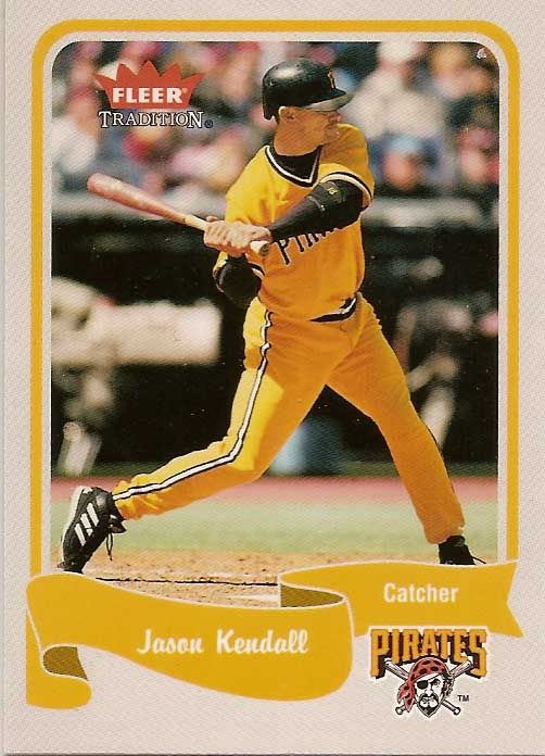
For the Pittsburgh teams, the traditional black and gold can be both a blessing and a curse.  Traditional?  Great.  But it also makes things a bit dull when it comes to throwback uniforms.  Nonetheless, this Jason Kendall card from 2004 Fleer Tradition is one of my favorite Pirate base cards.  The gold on gold combo is one that I don't believe the Pirates have worn at any other time (they wore gold tops and black pants during TBTC games in both 1999 and 2004). 

There hasn't been anything official announced for 2013 throwback games beyond the new Sunday alternates, though that's typical.  Should be fun to see what the Pirates have in store - perhaps some type of retro themed game during their series with the newly AL-defected Astros?

Sunday, February 24, 2013

Black and Yellow, Black and Yellow

Maybe it's just me, but I don't think I'm ever NOT behind on scanning.  Every time I get caught up, there's a card show or package coming in that makes the stack magically reappear in front of the scanner.  My fiancee is monopolizing the scanner today scanning old family photos, so some pictures of my latest additions will have to wait. 

Since we moved from Pittsburgh to western Ohio, I've found myself yet again expanding my collecting interests.  At home, Pens and Steelers cards were typically too overpriced to even consider, often being priced at 1.5-2x ebay prices at local shows.  Fortunately one of the few perks of the move has been an ability to add lots of Penguins and Steelers cards to my collection at great prices.  Not only has it given me something else to look for at shows, but it's also a nice little reminder of home each time I pull a card in the familiar black and gold. 


One of the (perhaps few) perks to being a Pirates collector is , oddly enough, the team's colors  The Pirates losing streak just so happened to coincide with pretty much every recent development in modern cards, meaning Pirates players were almost entirely excluded from most of the fantastic insert sets of the 90's and early 2000's, and have had comparatively fewer cards in most base sets than their Pittsburgh counterparts in hockey and football. 

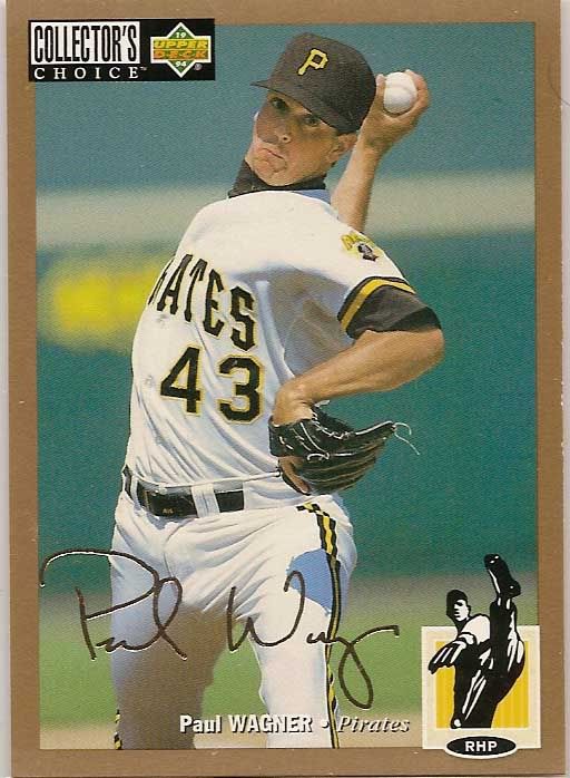
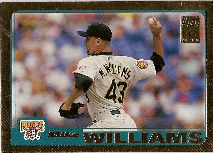
But the team's primary colors of black and gold also happen to be two of the most common colors used in parallel sets.  From Collector's Choice Gold Signature cards parllels in the mid 90's to the popular Topps Black and Chrome Gold Refractors today, the colored borders really make the team's uniform colors 'pop' in my opinion.

Pittsburgh's teams are of course unique for their color parity across all major sports, though the Penguins have shifted to a more muted Vegas Gold in recent years.  The Steelers are the only team in the city to maintain a singular color scheme throughout their history - the Pirates changed from a blue and red color scheme to the now familiar black and gold before the 1948 season, and the Penguins used a number of blue and white color combinations before switching over after the city's other two teams won their respective championships in the 1979 season.


Since the Pirate uniforms prominently display black,with a more subtle gold piping, I think the gold borders accentuate the secondary color.
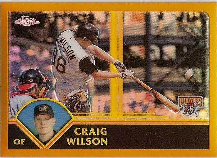
The 2003 Topps team set has some great action photography prominently featuring PNC Park, including this Craig Wilson card.  As an added bonus, the yellow of the foul pole really seems to bring this card together.


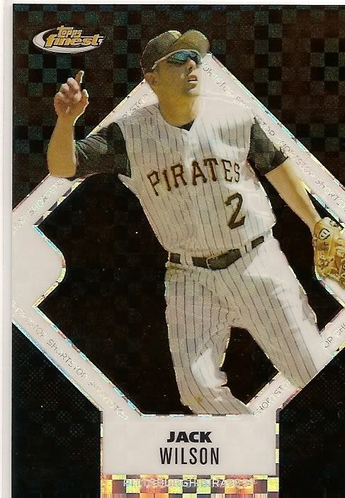
And capping off the color theme and players who's last name begins with a W, these two Jack Wilson refractors illustrate my point about the black on black color scheme.  While they both look good, the inclusion of the gold on the 2005 Topps Chrome refractor stands out more to me than the black-heavy 2006 Finest ref.  I would love to see the Pirates reintegrate a gold jersey into their uniform set at some point.

Monday, February 18, 2013

The Good, the Bad, and the Incredibly Uncreative: A retrospective of Topps Photography

The Topps brand is inexorably linked to the public conception of baseball cards.  To anyone from the most die hard collector to the most casual fan, Topps is an unmovable force in the baseball card industry.  Childhood memories are bound to the card designs of a certain year, the minute details of our most cherished cards branded into memory.

But cardboard nostalgia aside, Topps cards are as reliant aesthetically on their photography as they are on their card design.  And unlike the polarizing debates over card design, whether you love the wood grain '62 and '87 sets (I do), or think the '75 and '60 sets veered too far from the traditional formula (I don't), Topps photograph is a far more nuanced debate that seems to come up far less often.
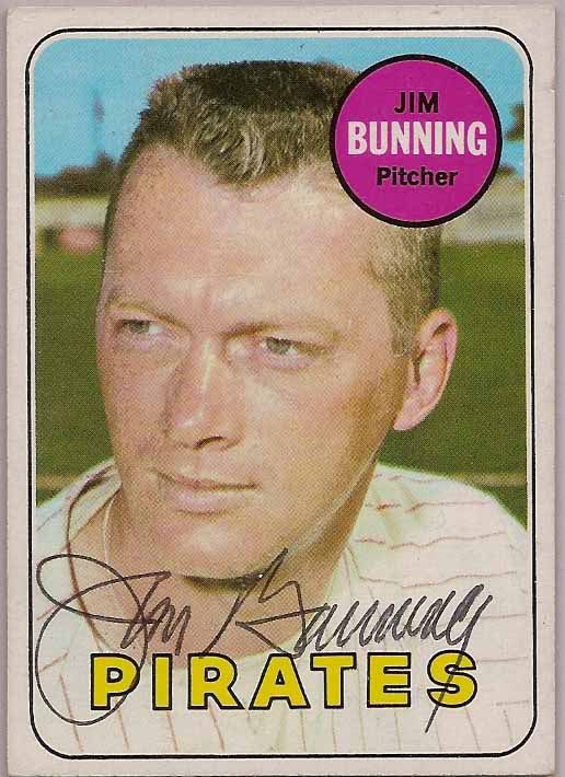
The first twenty five years of Topps cards offered little excitement or innovation for collectors in the on card photography.  The cards followed a fairly predictable formula: posed photographs, typically in the team's home jersey, taken at the spring training complex.  It was a logical plan: spring training would most likely have every player who would suit up for a given team during the season, barring trades, and in the pre-merchandise savvy era, there was no concern about teams wearing eighteen different versions of their jersey, with 4 alternate batting practice uniforms.  Throughout the '60's, various season highlight cards would integrate full action shots, and the early '70's introduced the In Action cards, featuring large action photos. 

But the overall visual approach was fairly simple: if we have a photograph of that player in a vaguely current uniform, print it.  If not, pay an intern to do a half-assed job airbrushing out the old logo.  The result was a sequence of years using photos clearly from the same photo session of a player.  Or better yet, players who appear in a string of airbrushed photos.  For example, Hall of Famer Jim Bunning spent 1968 and most of 1969 playing for the Pirates.  Despite appearing in two Topps sets, his only card in an actual Pirate uniform wouldn't come until the 1990 Pacific Legends set.  Nice work, Topps.

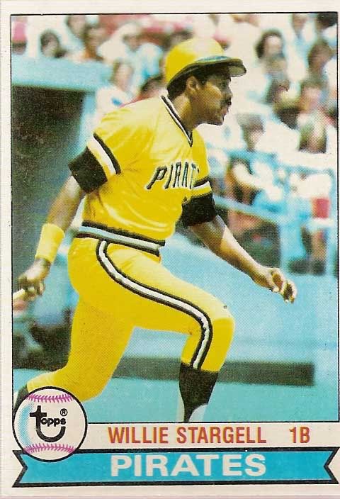
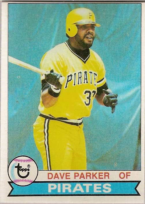
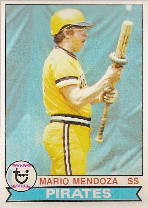
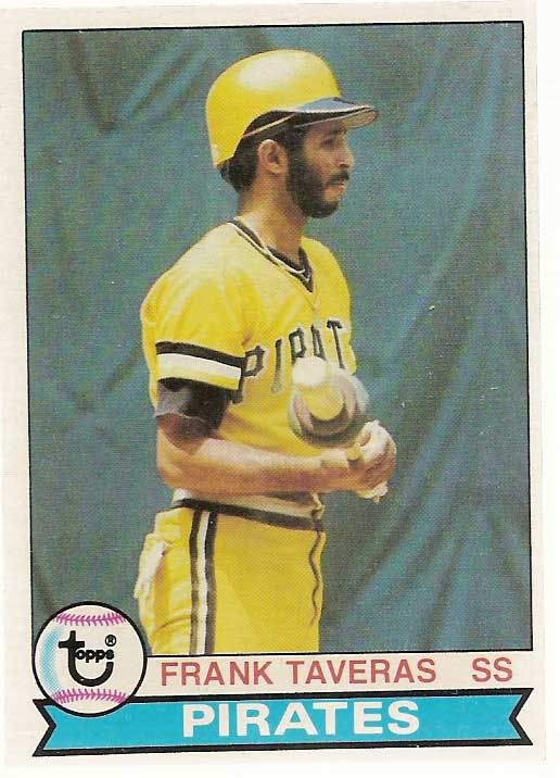
But even as Topps integrated more action shots into the base set by the late 1970's, the basic philosophy of getting as many photos as possible from one session still appeared to hold true.  The Pirates 1979 team set holds a special place in my heart for many reasons.  While it marks the last Pirates World Series victory, and a magical We Are Fam-a-lee club, it also marks an impressive feat in Topps photography.  I'll let the photos below speak for themselves.
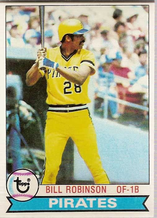


Seeing a pattern here?

The late 70's Pirates were known for their mix and match jersey combinations that included white pinstriped, black, and yellow pants and pullover jerseys.  Instead, it would appear that almost half of the team set was photographed on the same day, in almost the exact same position in the batters box or on deck circle.  Talk about variety.


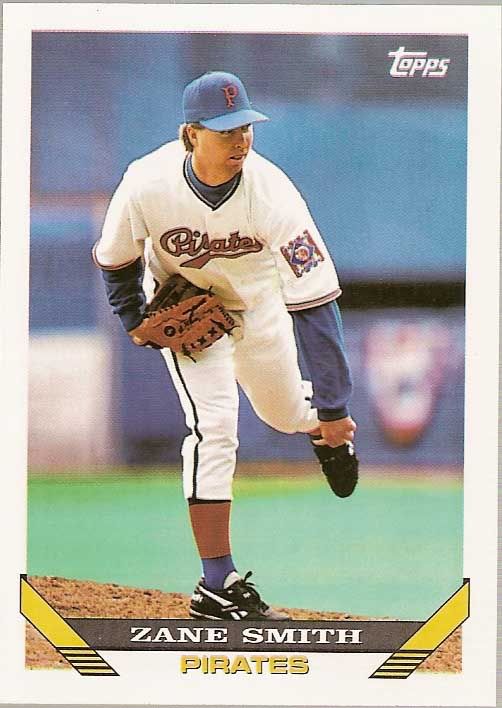
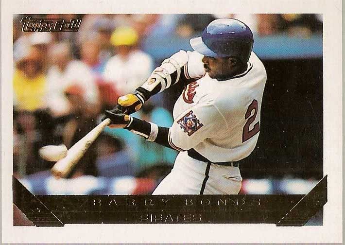
But it wasn't all bad.  Though the posed or pseudo action shots dominated much of the '80's, Topps included some great photography in the 1990's, perhaps not coincidentally coinciding with the development of the Stadium Club brand.  The 1993 set featured Zane Smith and Barry Bonds in 1938 throwback jerseys which the team only wore for one game. The jerseys are a unique nod to an 86-64 team that finished in second place, behind HoF'ers the Waner brothers and Arky Vaughn.  The '92 season marks the only time to date that the Pirates have worn the red/white/blue colored jerseys in a throwback game.


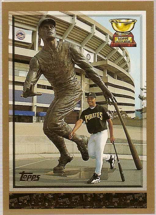
The photography in the 1998 set is perhaps my favorite of any Topps set, featuring an array of creative posted shots, horizontal photos, and unique action shots.  The Pirates team set also features two of my favorite Pirate base cards, #146 Jose Guillen and #365 Jermaine Allensworth.  At the time, Allensworth and Guillen appeared to be part of a young core of the Pirates (first) 5 year rebuilding plan.  Guillen's, a 21 year old Dominican right fielder with a rocket arm when he reached the majors in 1997 put up strong numbers for his age in his rookie season.  His 1998 card features him alongside the statue of Roberto Clemente outside Three Rivers Stadium, a parallel perhaps a bit ambitious for the promising Guillen, but one with unavoidable similarities nonetheless.  
Allensworth's, a first round pick in 1993 using the compensation pick gained from the departure of aforementioned Barry Lamar Bonds.  Drafted out of Purdue, Allensworth moved quickly through the Pirates system, reaching AAA by 1995 and featuring a high contact/speed combination that would become the hallmark for a revolving door of almost identical players for the following decade until the arrival of Andrew McCutchen.  Allensworth was one of my favorite players from 1997's Freak Show team that made an improbable run at the NL Central pennant.  Despite his pedigree and minor league success, Allensworth saw dips in his stolen base total and average which, coupled with his below average power, drove his OPS+ numbers into 80-90's.  He was traded to frequent trading partner Kansas City midway through the 98 season, and would see his last major league action with the Mets in 1999. 
Allensworth's 1998 Topps card features a great play at the plate at home against the Reds.  I love the way the elevated camera angle captures the play, and it's a bonus that the card features the Pirates black home alternates that were worn from 1997-2005.


Check back tomorrow for the second part of this series.  Tomorrow will take a look at the 2000's, as Topps reverts back to some of their old tricks, and the eventual discovery of licensed photography.