Sunday, July 19, 2015

Isn't That Precious?

I've slowly started weeding through my 200-card COMC order that came in a couple weeks ago as part of their Spring Cleaning promotion.  For most sellers, I imagine COMC amounts to the scrap heap - a place to sell cards they couldn't move on ebay with ease.  And that's fine with me.  After all, I always pride myself on my collecting patience.  Sure, it's come back to bite me in the proverbial collecting ass (Andrew McCutchen).  But on the whole, I usually have pretty good results waiting for the initial wave of excitement to die down around a card before snagging my copy.

I was planning on having a sizable Geno Smith collection as the NFL Draft approached a few years back.  And then the Jets called his name, and my hopes were almost instantly dashed.  Huge market with a quarterback crazy fan base?  While I would have much preferred to see Geno succeed, his cards have become more affordable in recent months.  And this Precious Metal Gems card is one of my new favorites in my collection.  And at a cool $3, I couldn't be happier.

 Speaking of prices cooling, John Holdzkom went from being one of the hottest names in Pittsburgh to a bit of an afterthought these days.  When Series 1 went live, this card was selling in the $5-10 range, and I was bummed when I didn't pull one out of a case break.  But Holdzkom has been in the minors this season, and middle reliever autos aren't the type to stay hot for long.  I was thrilled to snag a copy for about $2, though I could probably get one for half that in a couple years, even if Holdzkom does regain the form that made him an overnight sensation last year.
 I guess that's the funny thing about this hobby.  Everybody is ready to jump on the next big thing.  Until the next big thing comes along.  Even if a player goes on to have a solid major league career, their prices are almost inevitably going to decline in value.  It's just the nature of the hobby, but I'm more than happy to let that work in my favor.  In 2005, this card was probably a $3 card.  In 2008, it was a $30 card.  And a couple months ago, I was more than happy to buy it for $1.
 But it's not really about the price paid, print run, or serial number.  I've really narrowed down my collecting focus - I like cards that look cool.  Whether it's $.10 or $10, if it looks nice that's what really matters to me.  Of course I do tend to stick closer to the $.10 end of the collecting spectrum.


Saturday, July 18, 2015

Check Out My Haul: 2001 Donruss

My latest COMC shipment has been sitting idly in the box it came in for the better part of a week and a half.  Maybe this weekend will be the grand cataloguing process, maybe not.  I'm happy with the cards I added to my collection, but my relationship with COMC has been going downhill for a while now.

The site was a great resource for lower end cards when I joined in 2010 or 2011.  But then again, submission fees were only $.10 and shipping was $.15.  I could buy a card for $.50, with there still being enough meat on the bone for the seller to be happy.  Inflation, cost of doing business, yada yada yada.  You can argue whether the increases in cost are justified or not.  But at the end of the day, a card submitted now that sells for $.50 is basically the seller making a charitable donation to my account after the (at least) $.25 submission fee and the $.25 shipping fee.  And quite honestly, those cards I happily scooped up for $.35 or $.50 cents are far, far less attractive at $.75 or $1.

 Right around the time I decided to take on the 2000 TC Refractor set, I also decided to try my hand at the 2001 Donruss Star Line parallels.  Realistically, finishing the set was never in mind.  It's more just hoarding as many cards as I can, with the two tiers of parallels and offshoot retro sets.  But these are exactly the type of card that COMC used to excel at.  Fairly common parallels of fairly common players.  I'm sure in 2010 or 2012 I could have scooped many of these up without much problem.
 Today...I was thrilled to even find 5 new additions that fell into a price range I was willing to pay.
 Everything in collecting comes in cycles, and I realize for many the excitement of parallels numbered above 10 isn't at the top of their priority list.  But it constantly amazes me how tough it is to find some of these parallels - many of the cards in the Stat Line set are numbered in the 300-400 range.  Without thousands and thousands of copies, you'd think there would be a dealer at a show with a few here or there.  But they have been surprisingly tough gets for me.

What about you?  Is there a project you are working on that just seems head-scratchingly tough to track down?

Friday, July 17, 2015

Back to the Work Bench

I had a pretty exhausting day at work.  You know, the kind where you just wanted it to end at 10a.m because you knew things would only continue to get continually worse.

So by the time I got back home, I needed something to just let me mind relax.
 So off to the computer I went for a little r&r with my custom projects.  This is really the first time I have worked on new projects since the early spring.  But it was nice to get back into the swing of things, and the first day I can remember when I wasn't worrying about something that needed done at work or at home.
 I've been slowly plugging away at Jack Wilson cards in every Topps design.  Obviously the 2002-2012 years are already covered.  But it's going to be  tough challenge to replicate the photo quirks of each year going just by the limited photos available online.  I've been avoiding the early 50's and 60's releases, dreading the lack of portrait and posted photos available.
 Still, it has been a fun project to chip away at.  And considering how much my Jack collection has slowed in recent years, it's a nice little side project to add to my collection of my favorite player.

Speaking of projects...
As I was sitting at the computer, I had a little spark of inspiration for a new project that may eventually become a feature on the blog.  The Pirates got even less hobby than they deserved (which wasn't much) during the 90's and 00's.  And even during the years where Topps Traded was supposed to fill in the gaps, the Pirates were sorely under-represented.  After all, they were almost never buyers at the trade deadline - and the lone year they were, 1997, Topps didn't produce a Traded set! - and prospects were sorely lacking as well.  So...I introduce you to Topps Update Update.  I'll be filling in the gaps for some of the players, coaches, or league leaders who got passed over during The Dark Years.  First up will be 2001, though I may need an ink refill before the printed version becomes a reality.

Somehow Aramis Ramirez was absent from the 2001 Topps set, despite having a break out season.  He hit .300 with 34 homers, and had played in parts of three big league seasons (with 2 Flagship cards)  in the previous seasons.  But maybe it's a blessing in disguise, since it gave me a great excuse to use this awesome photo of the Pirates wearing throwback unis from 2001.  

Thursday, July 16, 2015

Catching Up on Customs

Things have been pretty slow around here when it comes to anything sports related.  Cards, customs...heck, even just watching a few innings of baseball.  I think I've watched exactly two complete Pirate games this year, and attended zero.  And oddly enough, I've been pretty much fine with that.

 But I had some free time this weekend, and decided to bust out Photoshop.  During my frantic custom making period a few months back, I ended up designing quite a few cards that never made it to print.  And after a little extra tinkering, had them ready to turn into real, live cards.  A few snips later, and these are my newest additions to the custom card wing of my collection
 This Jumpin' Jack Flash is one of the many customs I've turned out of my favorite player.  And this slight tweak on 1990 Donruss is definitely one of my favorite go-to designs.  For those who follow my arts and crafts projects, it might look familiar.  I printed a sparkly version in one of my test runs.  But I needed one that showcased the colors a little more in the collection as well.
And finally, one of my favorite newer creations.  This card is a take-off of a T-205 card featuring Pirates lefty Tony Watson.  It was tough to even come close to replicating the painted portraits on the original cards.  I was pleased with the final results when this one was completed, but since then I found a process that gives a more painted look to the photo, so an upgrade may be in store.

Wednesday, July 15, 2015

2000 Topps Chrome: The Inserts

Yesterday, I showed off some of the less than stelar star power from my 2000 Topps Chrome Refractor set-in-progress.  Today I'm back with the inserts, which thankfully have a little more pop behind them.

The thing I really loved about early Chrome sets was the fact that the sets almost completely mirrored the base sets, inserts and all.  As card releases moved away from being insert driven, the paralleled inserts and refractors quickly dried up.  But from about 1998-2001, the Chrome sets feature some absolutely awesome looking cards.  And the refractor versions?  All the better.
 In the Flagship 2000 set, foil was all the rage.  Obviously that doesn't translate to Chrome.  But Topps really stepped up to the plate this year.  Even without the foil features, the insert sets still carry a significant "wow factor" that really pops on the card.  The All-Star Rookie Team is by far my favorite insert in the set.
 But the set boasts a nice range in both design and player selection.  Sure, most of the "can't miss" type guys from the late 90's ended up being big time flops.  But that just makes the cards easier to track down.
 In fact, I have been having a much easier time getting the inserts at a cheap price than the base refractors.  And I guess the math checks out.  Refractors fall two per box, but there are nearly 500 cards.  While most of the refractor versions of the inserts are much tougher pulls (falling about once every other box, in most cases), the sets are much smaller.
 Not that I'm complaining.
I love the look of the cards.  And even if the master refractor set might be a long ways off, I'm holding out some hope that knocking out the insert sets might be a realistic goal within the next year.

Tuesday, July 14, 2015

Oooo, Shiny

Quite a few things have found their way to the back burner for me in recent months.  Blogging.  Collecting.  Getting to the gym.  Definitely need to get back on that last one.  But I've come to accept that my collecting ebbs and flows.

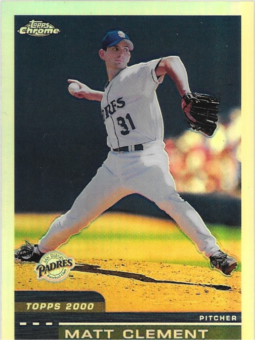
 Late last year I decided to take on the monster undertaking of the 2000 Topps Chrome Refractor set.  It seemed like a big project to bite off, but I had nooooo idea.
 I've been trying to keep my pickups of commons under $1, which has made things even tougher.  It seems like so many of those late 90's/early 00's cards have dried up.  And at just two refractors per box, there probably wasn't a huge supply to begin with.
 But with my latest COMC shipment, I brought home some more of these beauties.
 Sure, they're all commons.  But I'm glad to knock out a decent amount of progress on the set, even if it is a super-duper longterm project.
 The 2000 refractors have quickly become some of my favorite non-Pirate cards in my collection, and they bring back all sorts of warm and fuzzies when it comes to collecting, since this was really my first exposure to a "high end" product upon coming back to collecting.
It's a little laughable that what was a higher end $3 pack is now pretty much par for the course.  Then again...times change.  Matt Clement was a young hurler with a live arm and promise.  Now he's a high school gym teacher less than a mile up the road from me.  And no, he does not refract in person.

Wednesday, July 8, 2015

Hidden Gold

After a painstaking wait over the holiday weekend, I finally got my greedy hands on my latest COMC haul.  Thanks to the latest free shipping promo, 200 glorious new cards are now at home in my collection.  There are some great cards that fit into my various PC's that I'll be showing off over the next few days.  But sometimes the odds and ends deserve a little love as well.

Technically speaking, none of the cards in this post really fit into any particular aspect of my collection.  Unless you could my "Oooo, pretty" collection to be...a thing.
 Quite possible the most exciting pickups was this pair of 2001 Topps Chrome refractor inserts.  2001 Chrome was a great set, and the refractor versions of the inserts were a tough pull.
 Maybe I'm in the minority, but I love the fact that I can buy copies of cards I could only dream of pulling as a kid for under a buck.
 Speaking of under a buck, for $.50, I couldn't pass up on this crazy Focus Pocus insert of Ripken.  The orange and black colors give it a little extra Halloween spin.  But most importantly, check out the Turn Ahead the Clock jersey!  Maybe Nick and I are the only collectors in the world who obsess over these things, but I can't thank the Artist Formerly Known as Fleer enough for using some of these photos on their inserts.
 And while it isn't quite 90's nostalgia, this Crime Dog Diffractor from 2014 Tek was close enough for me.
 And there may be no better 90's sweet spot than rare cards of failed prospects.  Nostalgia?  Check.  Guy that was technically once a huge hobby name?  Check.  Awesome card?  Check.  So considering I've never even come close to one of these Gold Label parallels of a Pirate, I'll gladly take it for a mere $.75.  Not too shabby for a card from one of my favorite sets of all time.
And *sigh* teal Marlins jerseys.  I swoon for you.

Now I just need to catalogue the other 190 cards in the box...