For those that missed it, Part 1 can be found here.
Now...back to the counting.
55) 1989 Topps
Topps made improvements from 1988 to '89. Marginal improvements.
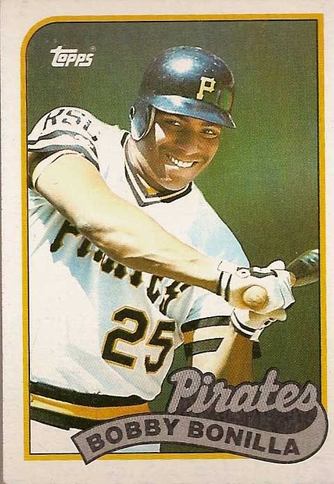
The design was a little less painful. The photos got were a little more interesting. But as a whole the design is better lost to history, which is something that can probably be applied equally to the latter part of the decade entirely.
54) 1967 Topps
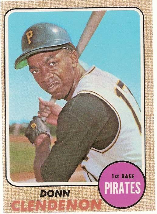
Pretty much every statement made about the '80's above can be applied to the releases of the late 60's as well.

This Giles card is a great shot. But it pales in comparison to the photo used for his Stadium Club card. And that's the legacy of the 2002 set. Nice, but just not enough.
52) 1994 Topps
 The 1994 set offered some nice photos of a team that had fans hopeful the team could soon return to their winning ways. But there's just a lot going on here, and the design feels more like the Saved By The Bell set than a baseball card design.
Lines, lines, lines. The strip on the bottom feels very reminiscent of the much cleaner 1993 Donruss design. And the yellow line and green fill give an interesting baseball diamond effect without taking away from the photo. But there's just too much going on. And what's up with that font? It looks like it would work best as a neon sign.
Nice try guys, but no thanks.
51) 1984 Topps
For all the complaints I have about the '94 set, the '84 release did a great job making the most of a clean, simple design.

54) 1967 Topps
Pretty much every statement made about the '80's above can be applied to the releases of the late 60's as well.
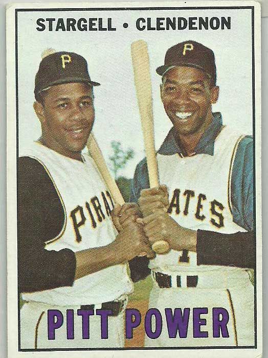
The '67 set offers an underwhelming design and a glaringly out of place purple font. The cards lack the action photography that would make it into the early 70's sets. I've never been a huge fan of Topps' white bordered sets to begin with, but if you're going to go with the white border there at least needs to be something to add some character to the release. This set has nothing even close to that.
53) 2002 Topps
The 2002 release isn't a bad set. But it certainly pales in comparison to many of the other releases that year, not least of which was Stadium Club. The photos used in the flagship set just felt like the leftovers after the Stadium Club team had their pick. The result was an underwhelming set emphasized by a border color and foil stamping that are just too close in color for my liking.

53) 2002 Topps
The 2002 release isn't a bad set. But it certainly pales in comparison to many of the other releases that year, not least of which was Stadium Club. The photos used in the flagship set just felt like the leftovers after the Stadium Club team had their pick. The result was an underwhelming set emphasized by a border color and foil stamping that are just too close in color for my liking.
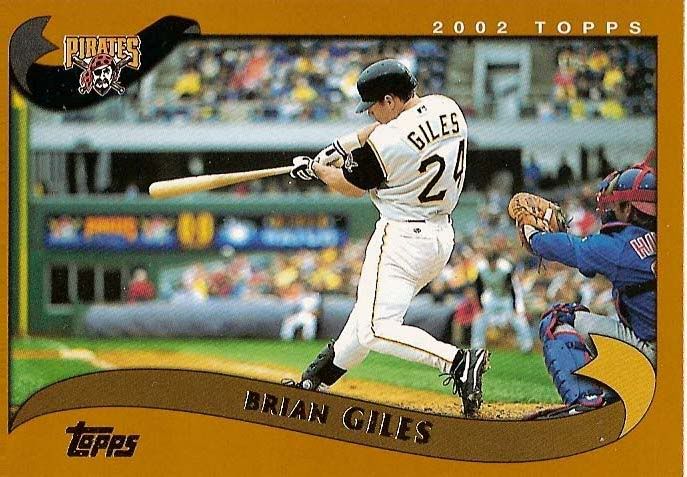
This Giles card is a great shot. But it pales in comparison to the photo used for his Stadium Club card. And that's the legacy of the 2002 set. Nice, but just not enough.
52) 1994 Topps

Lines, lines, lines. The strip on the bottom feels very reminiscent of the much cleaner 1993 Donruss design. And the yellow line and green fill give an interesting baseball diamond effect without taking away from the photo. But there's just too much going on. And what's up with that font? It looks like it would work best as a neon sign.
Nice try guys, but no thanks.
51) 1984 Topps
For all the complaints I have about the '94 set, the '84 release did a great job making the most of a clean, simple design.
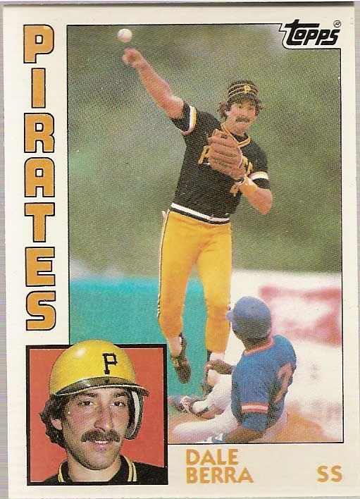
I love the prominence of the team colors in the card design, which really accentuates the photos. Perhaps the corner headshots could have been a little big smaller (especially with the number of mustaches on the team), but it adds a nice feature to the card. There is a lot going on in the margins, but nothing in the design pulls you too far away from the main photo.