Thursday, March 14, 2013

Pops

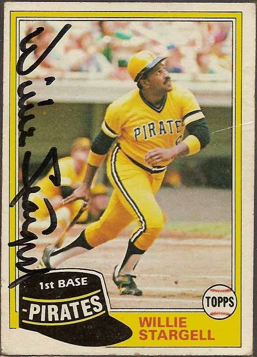
One of my few hobby related regrets is that I never had the chance to meet Willie Stargell in person.  As almost certainly the second most famous modern day Pirate, behind Clemente, and the only one of the two alive during my lifetime, it would have been great to meet such an amazing player.

I'm sure Pops did at least a few public signings in Pittsburgh during the 90's, and it would have been great to get his autograph in person.  Every story I've heard about him at signings describes him as very personable and friendly.

But alas, it wasn't meant to be.  However, I have been able to pick up a few IP autos in addition to the certified cards he has.

This one came from a dealer I know well.  He buys a lot of collections locally, and he gave me one heck of a deal on this one, since he doesn't deal with uncertified autos.  A whopping $1.  The card comes from the collection of a big time Pittsburgh collector, and I have little doubt about its authenticity.  The card isn't in the greatest shape, but it's a beautiful signature on one of Willie's last cards as a Pirate, wearing the great mix and match pullovers.

Tuesday, March 12, 2013

Throwback Tuesday

Today's post is a bit of a hybrid - part Throwback Tuesday, part Pirate autograph project, and part some long overdue new arrival scanning from the weekend.  Put it all together, and you either have Franken-post, or a great looking vintage autograph.  Take your pick.

Art Swanson is a guy whose story is fairly common among the 1950's Pirates teams.  He made his major league debut at 18 after being signed as a bonus baby, appearing in one game in 1955.  Swanson would get a cup of coffee again in '56, before getting an extended look in 1957.  During that season, he pitched in 32 games for the Buccos, starting 8.


Swanson would continue pitching in the Pirates system until his retirement in 1962, but added depth around the Pirates World Series year pushed Swanson down the depth chart.


I had been aiming to get this card signed for a while, but had mistakenly believed Mr. Swanson had passed away.  Realizing he was still alive and an active signer through the mail, I picked up a copy at a show for a couple dollars and sent it off in the mail.  As you can see, I'm pretty pleased with the way the card turned out.

Monday, March 11, 2013

#9,000

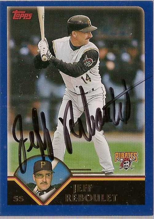
Being a team collectors can be both infinitely rewarding (how many people can get psyched up about finding a Jeff Reboulet base card?) and infinitely frustrating. 
It means you can never run out of new cards to come across, and always find something you don't have on ebay, COMC, or card show dime boxes.  It also means you will always find something you don't have.

This weekend, some card show additions pushed my official count above 9,000 unique Pirate cards.  Beckett currently lists a little under 50,000 Pirate cards in their database, of which over 10,000 are 1/1's.  Maybe it's a little intimidating when you look at the numbers in those terms, but it's still pretty cool to think that I have roughly 25% of every Pirate card ever produced.

Of those remaining 30,000, most will probably never make it into my collection.  Some are simply too low numbered, and the odds of coming across a stray copy at a decent price on ebay or at a card show is low.  Others will permanently be either out of my price range, either due to their inherently insane price tags or they simply cost more than my "internal value" of the cards worth to me personally.  Still, there are always those cards that surprise you.

 When they came out, the Stadium Club Beam Team autos were among my favorite cards.  The stained glass look is both a nostalgic throwback to a great 90's insert and a card that just flat out looks great in the right lighting.

The set featured Pirate autos of Tom Gorzelanny and Ronny Paulino, and I have had completed the "rainbow" of both players (base, silver /99 and gold /50, though the base by far looks the best), and called it a day.  So it was much to my surprise that a package from a friend the other day left this Freddy Sanchez auto staring back at me.

You see, in 2008, Freddy Sanchez was still a hot commodity whose autos sold for more than I was willing to pay.  I had picked up the lesser autos in the set, oogled my stain glass rainbows, and called it a day, completely setting out of mind the third Pirate in the set.  Nice surprise, huh?  Guess I'll have to hope copies of the gold and silver surface eventually.

Speaking of shiny things, I can't get enough of gold refractors.  As I mentioned before, the gold bordered Pirate cards always make the card stand out in my mind.  There haven't been a lot of Pirates in Bowman Chrome sets over the years compared to most teams.  But I love picking up the gold's when the opportunity presents itself.  At less than $3 dlvd, I was thrilled to add Shiny Ryan Doumit to the collection.


 But quite honestly, I love any and all refractors.  The white were a unique look for the 2007 set and are reasonably affordable (this one set me back $.40).  Not to mention I love the pinstripe vests and the All-Star game patch from 2006 on the chest.

And finally, quite a few of my recent additions have been the Target and Wal Mart base Topps parallels.  For years, the retail exclusive Target (Retro, and later Red) and Wal Mart (black then blue) parallels were a gaping hole in my collection.  And the pre 2012 cards still are.  But one perk to moving to the Middle of Nowhere, Ohio is that a couple dealers out here seem to bust Topps retail by the case.  I have been able to put together a team set of 2013 series 1 blue and red for between $.10-.20 a card, and have a good portion of the 2012 series done as well.  Now if only I can make some headway on those pesky 2009, 2010, and 2011 sets.


Sunday, March 10, 2013

Turn Back the Clock(s)

Since we all turned back the clocks today, here are a few cards doing the same.

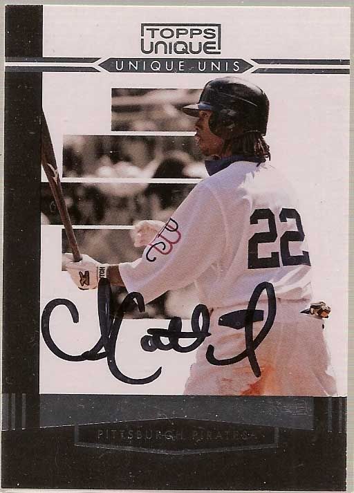
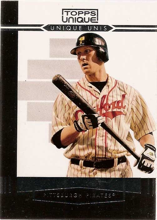
Topps Unique was an all-around unremarkable set that only lasted one year.  It was released late in the season, and was probably completely forgotten by most collectors soon after.  But it also includes one of my favorite insert sets: Unique Unis.

The set includes quite a few gems, including this photo from Andrew McCutcuen's rookie year in vintage 1909 uniforms.  Topps used a few photos from this game for cards, including Delwyn Young's Topps Update card and McCutchen's card in Topps Ticket to Stardom.
Though he was in Boston by the set's release, I believe this is the only card to date featuring the Pirates in Pittsburgh Crawfords NNL unis.  A great card paying tribute to an important piece of baseball history.


And finally, the Steelers get in on the uni action as well.  The Steelers wore these retro uniforms as third jersey alternates for a few seasons.  I really liked the gold helmet/black jersey combo, and hope the team continues to work in more throwback jerseys in future seasons.

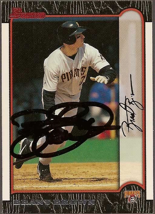
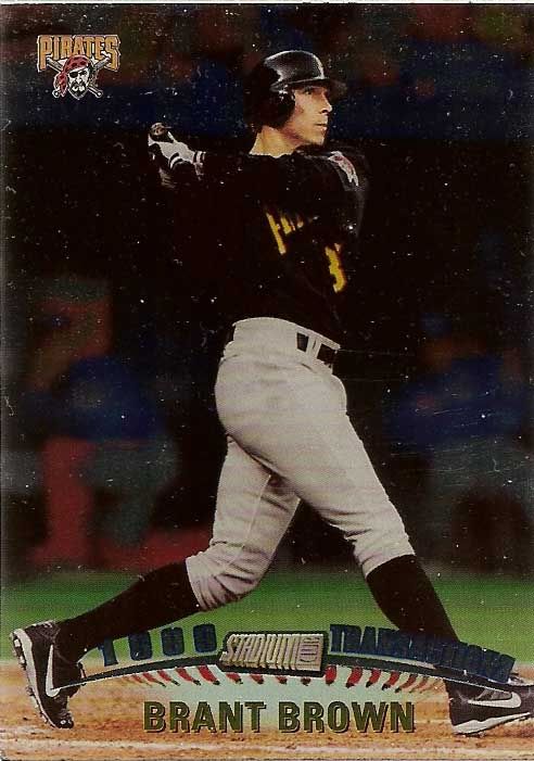
Brant Brown

Brant Brown was the kind of player who at 10 years old seemed cool.

Later analysis has since concluded this was far from the truth.  But still, Brown is one of those childhood favorites who continue to stick in your mind, against better judgment.

Brant Brown played for the Cubs, the team I probably watched most frequently growing up, in the late 90's.  And he was that type of player that just seemed like a good player to root for - he had a cool name (gotta love alliteration), and could hit for decent power.  Brown came to Pittsburgh for Jon Lieber, and it looked like a perfect match.  One of my favorite hitters in exchange for what amounted to a spare piece in a rotation that was shaping up pretty well.

But like to many things in recent Pirate history, the trade was a flop.  Lieber went on to have a long and productive career pitching for contenders as a back of the rotation starter.  Brown spent one year in Pittsburgh, striking out in over 30% of his plate appearances and hitting in the .230's before being shipped to the Marlins for equally forgettable Bruce Aven.


Still, there's a little part of my brain, devoid of logic or reason, that gets a little excited when I come across a new Brown card.

Friday, March 8, 2013

You've Lost That Lovin' Feelin'

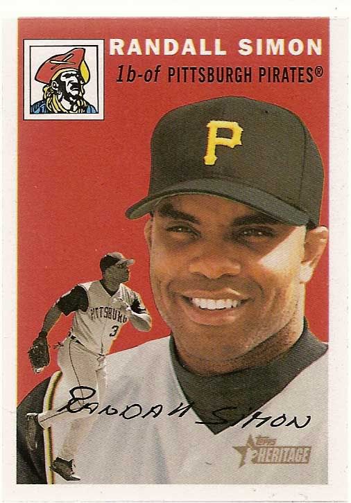
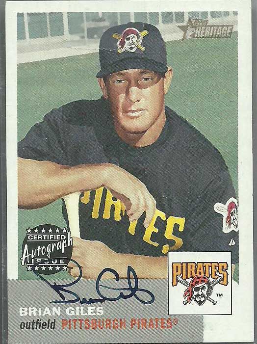
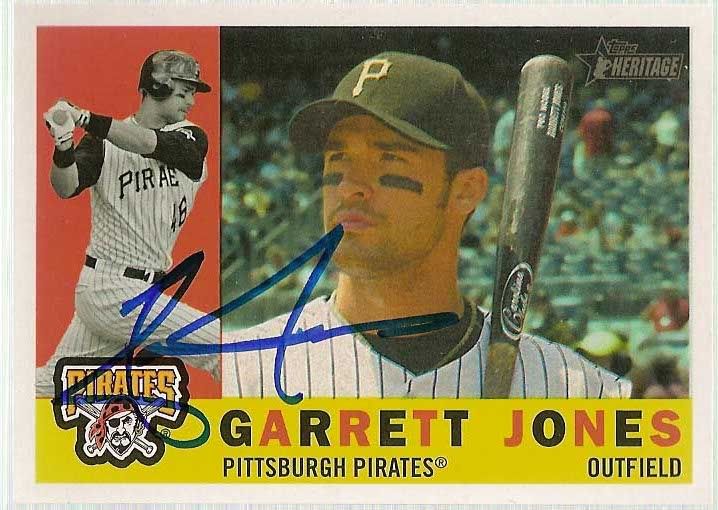
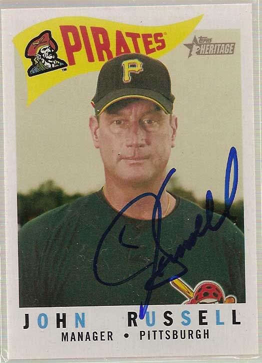
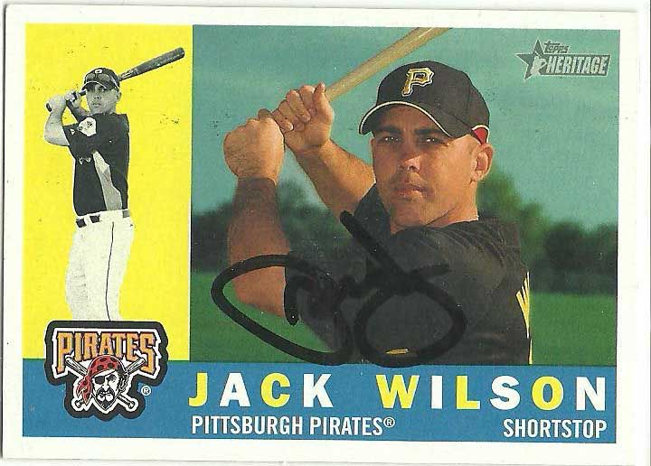
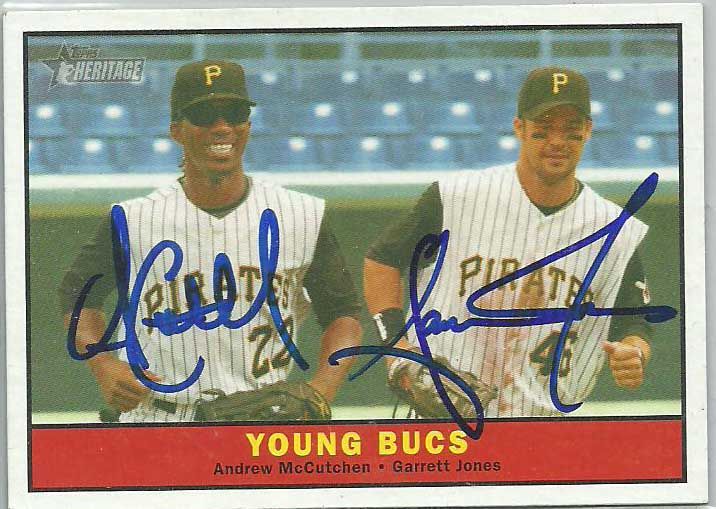
http://battlinbucs.blogspot.com/2013/03/the-team-card.htmlI think by now it's safe to say that 2013 Heritage is an unmitigated disaster.

Hideous design?  Check.  Awkwardly cropped photos because they were too cheap to get dead on head shots?  Check.  An assortment of irritating short prints?  We're on a roll.

Don't get me wrong, I'm sure the product will sell well.  I'm sure Heritage collectors will talk themselves into some half-hearted reasoning to justify building a set the way you justified your seventh grade girlfriend in hopes that you would get to second base.  And much the same, you'll probably find Heritage cheating on you behind the bleachers after school with Topps Fusion.

But let's not dwell on the Heritage set that broke your heart - after all, Topps Heritage and I had some good times together.  Sure, it's ending messy.  But that doesn't mean we can't remember what we once had.

You see, I first met Topps Heritage in 2001.  Ironically, I was indeed in seventh grade at the time.  2001 is still by far my favorite collecting year - I had just started seriously following the Pirates, my favorite company, Donruss, returned to the hobby landscape, a crop of red hot rookies had card companies cranking up the presses, and a series of retro-inspired products seemed like the coolest thing ever to pre-teen me.  Topps was in their 50th anniversary season, celebrating with a series of reprint and retro themed cards in the base set, Topps Archives and Archives Reserve, Topps Gallery.  UD and Fleer even got in on the action

But none could compare to 2001 Topps Heritage.  Modern players pictured using the famous 1952 design?  Plus a stick of gum?  The concept seemed brilliant.  It would seem quite a few collectors agreed. 

The set had a lot to offer, despite the irritating base set SP's.  I mean, how could you go wrong with a classic set like 1952 Topps?  The following years continued to offer fun, fresh followups to the initial release. 

At the time, the idea of owning an actual '52 or '54 Topps card seemed unfathomable.  Instead, these cards of my favorite players in those classic styles were the closest approximation to "vintage" at a point when a 1978 Topps Dave Parker/Rod Carew League Leaders was the crowning jewel of my vintage collecion (followed in a close second by 1987 Topps Sammy Khalifa).


The Heritage sets still felt fresh and novel; something old meeting something new.  The twists and turns to the set felt more quirky, matching the actual quirks to the original sets, than formulaic and predictable.  Chasing the SP's and few inserts felt like an exercise in recapturing baseball's past than a bothersome chore for the cranky completest.

I never attempted building the full set, but I imagine the feeling must be pretty similar to inspect and appreciate each card individually.  The products offered a perfect bled of old and new, offering just enough to the nostalgic collector, set builder, hit chaser.  Aesthetically, the 50's-style Heritage cards just look sharp.  Maybe the success of the line is less a credit to 21st Century Topps, and more a credit to the timelessness of their designer's during the Cold War. 

So maybe it shouldn't be a surprise that my enjoyment of Heritage started waning a few years ago.  The late 50's designs are among my favorites, but the sets felt weak.  We just didn't have that connection like we once did.  Heritage had lost that lovin' feelin', as the Righteous Brothers would so brilliantly (para)phrase it.


A series of decisions seemed to take much of the glitter off of Heritage.  The autographs became more common, as the autograph subjects became less than inspiring.  Topps removed the Chrome and Refractor parallels from the set, instead inserting them in a variety of weak Topps products.  The photography seemed to be phoning it in, using dull, uninspired photos that were often recropped versions of shots used elsewhere.  Still, I wasn't read to give up on what had once been a good thing.

And Topps gave me hope with the 2009 set.  The 1960 design is one of my all-time favorite designs  (in case you haven't noticed, I really enjoy horizontal cards), and the set include all of the features that made it fun.  The set felt fresh again.

But the releases since then have again felt uninspired.  With the exception of a few outstanding cards, the sets just haven't offered much that interests me.  Couple that with strong irritation from last year's Heritage High Number set, and Heritage just isn't a release I look forward to at this point.  And it certainly doesn't help that the next few years are, in my opinion, some of the absolute worst designs in Topps history (though I do like the '65 set), and it's not a good sign.  Of course none of this is particularly newsworthy - Topps has been going through the motions each year with many of their retro themed sets.  And as I said - set collectors and casual collectors will continue to buy them.  Until a serious decrease in sales is seen, we can probably expect the same run of the mill quality and effort behind Heritage as we see in most Topps products.

But at least we've got Bill Medley to make things better...
Thursday, March 7, 2013

You Call *That* High End?

It's been years since I have opened any wax, save for the stray pack here or there.  And there's countless good reasons for that, but one of the most pressing is the insane price of many of the products coming out.  High end wax is, at best, a gamble that people keep coming back for time and time again.

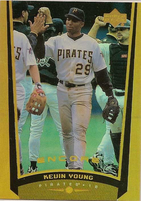
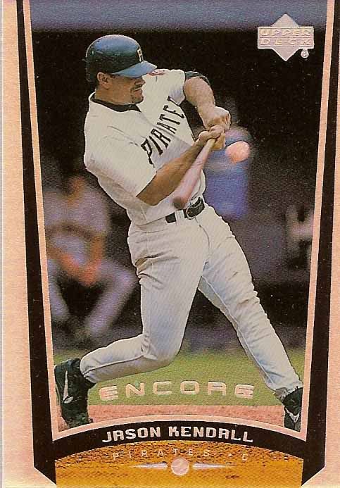
But do you remember what high end products used to look like?  The late 90's saw the first wave of truly high end products - great designs, cutting edge technology, and the array of inserts and "hits" that collectors now expect in every pack.  One of my favorite such products was 1999 Upper Deck Encore.  A condensed version of the Upper Deck base set (a la modern day Topps Chrome), Encore featured rainbow foil base cards, a ton of great looking inserts, and tons of fun.

Like so many 90's products, the set was light on Pirates.  Half a dozen base cards, zero inserts - and one of my all-time favorite parallels.  Encore Gold cards were numbered /125, and a relatively tough pull at the time.  The cards featured the same rainbow foil as the base cards with a gold background.  But even the base cards put most modern inserts to shame.

I opened a box of 99 Encore a few years back, and it was one of the most fun breaks I've had to date.  The box yielded a complete base set, minus SP'd rookie cards, around 2 dozen great looking inserts, a Travis Fryman Encore Gold, and a Tony Clark game used hat card.  In 1999, the box would have been a goldmine.  Still, well worth the $20 or so I paid for the box, and a blast to see many of my favorite players from the late 90's coming out of packs that never would have been in my card budget at the time.

It's nice to see Topps putting some more creativity into inserts - sharper designs, more die cuts, and some cool throwback concepts have made their way into sets over the last few years.  Still, I'd much rather see high end sets that look like this than the busy designs with a couple splinters of wood and a hideous autograph sticker that come out of most "high end" products these days.