Thursday, February 11, 2016

Pirates Autograph Project: #4


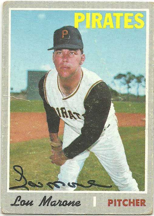
Baseball wouldn't be as interesting without a guy like Lou Marone.  First off...the name.

Secondly, he pitched 29 games of 2.55 ERA ball out of the Pirates bullpen in 1969.  At age 23.  Not bad, right?

But in the pre-expansion era days, there were only so many slots to go around.  He appeared in one game in 1970, and was out of baseball by 1972 at age 26.

Man, am I feeling old.

Then again, maybe Marone was a flash in the pan.  He made the majors on the strength of 17 appearances in AA that year with a sub 1 ERA and 11 k's/9.  Add in the major league numbers, and it's a pretty nice year for a 23 year old.

But 1969 was also the only time, at any level, that he would post a sub 3.50 ERA.  But hey, if you're gonna peak, might as well do it in the bigs.

Marone died this past November at age 70.  The card, his only major league release, is a high number in the 1970 set.

Taking a Crack at 2016 Topps

When the design mockups for 2016 Topps came out, I was a little crushed.  I wasn't a fan of 2015 Flagship, with its busy design and photoshopped photos.  And then 2016 moved the needle a little further.  Rather than looking like a baseball card, it felt like a graphic you might see on ESPN.  And I don't mean that in a complimentary way.  The hazy smoke.  Touched up photos.  And...what is up with all the bars and gradients?


But give it a chance, I said.  I'm not a glass half full kind of guy.  But I try to be one from time to time.  Lots of Topps designs don't look great as photoshop mockups, but once you add in the foil and accents, the real thing doesn't look as bad.

As bad.


We were at Target over the weekend, and I just couldn't resist.  I had to grab a hanger pack and see what they looked like for myself.  And then I was crushed.  Really crushed.  Gone is the customary foil, which I thought might be able to save the design-crazy logo and name areas.  Sure, there's a little speck that makes up the Topps logo at the top.  But for all intents and purposes, these are Opening Day cards.  And where there's smoke, there's fire.


While I used to love reprint sets 15 years ago, they just feel tired and overdone.  Like so many of the tricks in Topps wheelhouse.  Thanks for reminding me how much cleaner cards looked in 1963.  Maybe I should just spend my money on vintage sets.  Good idea, Topps.


Overall, the inserts were underwhelming.  Which was disappointing, since in past years I have really enjoyed most of the Flagship inserts.  Again, a little too much going on here, and while I loooooove flashback cards the focus on the young stars of the game just seems so misplaced here.  Like the 1st HR cards last year, a debut card is cool.  Except when that debut came just a couple years ago.  A 2002 debut?  Cool beans.  2012?  Call me again in 2023.


The rainbow foil cards are back this year, and hopefully not as impossible to find as last year.  But I'm so over the Topps parallel palooza they've paraded out in recent years.  I loved the sparkles, and cognacs, and even the emeralds.  I started slipping with the red foil.  And rainbow?  Couldn't care less.  Though with this design I do think they could give some of those Yu Gi Oh monsters a run for their money.

 Oh hey, a rookie!  Wait...a rookie who also made your All-Rookie team for last year?  Oh...nevermind.


I just can't muster the energy to care.  Maybe Stadium Club can save the cardboard season for the third year in a row.  Until then, wake me up when Topps goes back to making baseball cards that look like baseball cards.

Monday, February 8, 2016

An Impluse Buy

There's nothing wrong with the occasional impulse purchase, right?

Right?

I sure hope not, because when it comes to cards I'm a sucker.  I can resist eating out for weeks at a time.  Squeeze that last drop out of the toothpaste tube.  Make a meal from those random food items that always get pushed to the back of the pantry like I'm a contestant on Chopped.

But all that self restraint and thriftiness goes out the window when I see a shiny baseball card.

I'm a sucker for the 1998 Donruss Signature set.  It is, in my eyes, the greatest looking autographed set ever made.  And the crown jewel is the Century parallel /100.  The dark royal blue just makes the cards pop in a way I love.  Except that they're an autographed 90's insert /100.

The opposite of thriftiness.  I have a couple Pirates, and a couple more unnumbered replacement cards that came onto the market in the Donruss bankruptcy sale.  But when a few true, numbered, copies were listed last week I knew I had to at least take a crack.

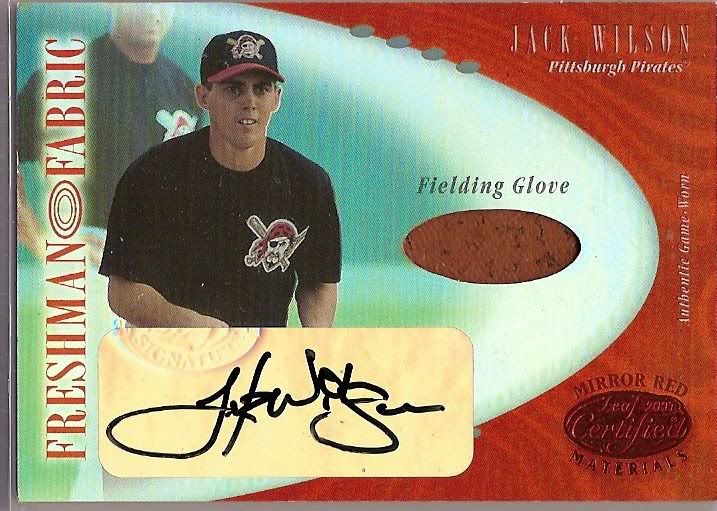
Most I ended up handily outbid on.  But I was able to snag one.  For the tune of about $2.  Wilson even has a vague Pirates connection, spending some unmemorable time with the Bucs, which was a far fall from the Indians powerhouse teams he had been on previously.

Did I mention I landed an autographed rare 90's insert for $2?  Yep, no complaints over my impulse buys here.

Pirate Autograph Project: #3


I've been working on acquiring an autograph of every players since the end of WWII to appear in an MLB game for the Pirates.  I'll be (hopefully) posting one autograph each day.


I'm front loading the early portions of my PAP postings, but can you blame me?  This card is one of my favorites in my collection.  Not only is it a beautiful signature on a design that makes great use of white space, but it's also a pretty tough signature to nail down.

Benito Santiago's career travelled the spectrum from ROY, perennial All-Star and Gold Glover to...Pittsburgh.  In the mid 00's, Pittsburgh was the last stop on the bus for quite a few former all-star caliber players who had little to nothing left in the tank.

While Benito was in his age 40 season when he hit Pittsburgh, it was cool to see a bigger name player take over behind the plate after trading away Jason Kendall.

Santiago had come off of a decent but injury-shortened season with the Royals in 2004.  But his stop in Pittsburgh never really got a chance to get going.

And it's interesting how we remember things.  I thought Santiago fell into the old Davy Jones Locker outside PNC Park, performing at Derek Bell levels of woefulness.  In reality, the Bucs gave him a whopping 6 games and 23 at bats, during which he was playing about at his career averages.  Not bad for a 40 year old catcher.

I suppose at some point between trading for him in December and early May, the Pirates apparently decided they needed to get older.  This kind of well thought out planning was pretty typical for those Pirate teams.

Some ab's would go to David Ross, who has now acquired grizzled veteran catcher status himself.  But the Pirates would cut bait too early with him as well.  Instead, the bulk of the ab's went to Humberto Cota, who put up an OPS about 60 points lower than what Santiago had done the year prior.  It shouldn't shock you that Humberto Cota never reached the majors after the Pirates finally released him.

So despite 23 ab's and 6 games, somehow Benito Santiago was included as an autographed card in Topps Update, despite never actually having a flagship Topps card as a Pirate.  And having not played for either team pictured for at least 9 months.

But I'm more than grateful this card exists.  For a while, I'm pretty sure it was the most expensive non-Jack Wilson card in my collection.  I think it cost a whopping $7.  But hey, I was in high school and funds were tight.  And ebay shipping was also $2 on the high end back then.

Sunday, February 7, 2016

Pirate Autograph Project: #2


Yesterday I went with a modern player.  So let's dig a little deeper.


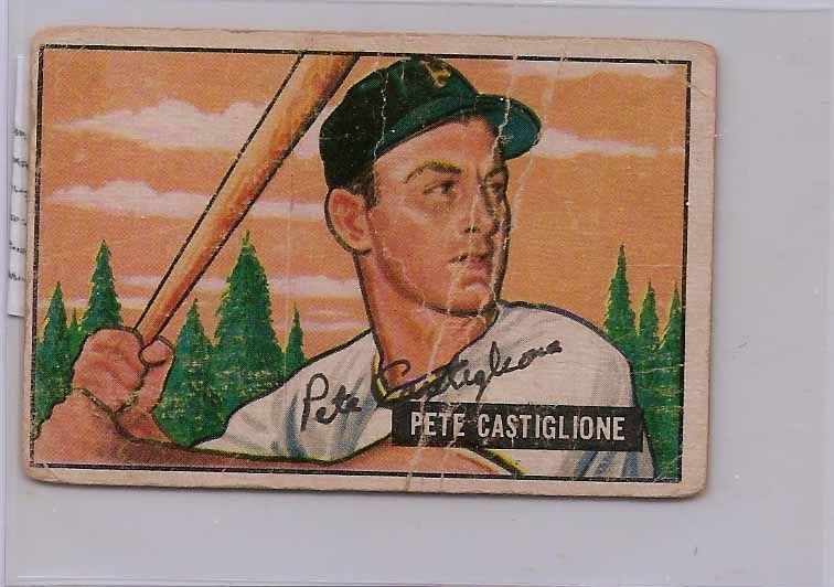
From a purely aesthetic standpoint, I absolutely adore this card.  I love the colors on the sky and pine trees, and it's a really unique look.  In retrospect, I wish I had been able to acquire a copy in better condition.  But I got this card signed in high school, and I think at the time my priority was to track down the cheapest possible copy I could find.  And in the days before COMC, that could be a tall task on ebay.

Castiglione played for the Pirates from 1947-1953, seeing regular duty for some rough teams during '49-51.  He was a pretty effective utility player, splitting most of his time between third and short, but also seeing duty in the outfield and at first on occasion.

Saturday, February 6, 2016

Pirate Autograph Project: #1


For me, becoming a team collector was actually a pretty long journey.  From "everything" collector, to Jack Wilson player collector, to Pirate certified auto collector.  But the jump between having a few hundred Pirate autographs and having 16,000 Pirate cards different Pirate cards, a wall of binders, and a mess that makes Kate consider murder every so often was a big one.  And the turn that took me down that path was when I decided to start my Pirate autograph project.

Instead of just collecting a certified auto of every Pirate who had one, why not get an autograph of EVERY Pirate to every don the stylized P?  That aspect of my collection has taken a back seat in recent years, but it's still one of the most enjoyable projects I can imagine.  Because alongside autos of Stargell or McCutchen I have guys like Mario Mendoza and Don Kelly, and they're all just as important to the project.

So while I've posted additions to the Pirate autograph project here and there throughout the life of Battlin' Bucs, why not go through and show off all 586 different Pirate players whose scribble I've managed to acquire.

I've made the arbitrary start date of the project players who played post WWII, to give myself a little more manageable goals.  But at about 56% completion, there are still plenty of autographs left to track down.


And what better way to start than with my #1 guy, Jumpin' Jack Flash.  Of all the Wilson autos I have, his signature on his rookies is by far my favorite before he switches to a less intricate and more loopy signature.

Over the coming months, I hope to get around to scanning and posting all 586 (and counting) autographs, and maybe even getting back to making a little bit of a dent in the project this year.  Hope you guys enjoy following along!

Tuesday, February 2, 2016

Topps Update Update: An Update

Things have been hectic around here, good, bad, and otherwise.  Last week was a pretty rough week, and I needed to just kick back and do something mindless over the weekend.  

And what fits the bill better than putting together some custom cards?

I started working on my Topps Update Updated sets a few months back, filling in the gaps that Topps inevitably misses every year.  I've been skipping around, taking on years here and there as I had the templates built.  But I finally decided to take a crack at some of the 2010's sets.  These have actually been some of the easiest to do, simply because there are so many more high quality digital files available for some of the more obscure players than someone who appeared in 3 games in say 1992.

I was very surprised how many players I needed to create cards for.  But then again the Bucs cycled through quite a few players in those seasons.

If you'll allow me a brief humble brag, the above card is my favorite from the 30+ card batch, since I actually own the game used jersey that Daniel McCutchen is wearing in that photo.  Game matched?  Check.  Though I do wish it were the jersey for that other McCutchen guy...


 With more photos available, I was able to get a little more creative in finding a cool photo for some of the cards.
 When you end up with the same design for the 40-50 players that appear on a major league roster each year, there are only so many different positions you can find your average pitcher or batter in.  So it's always nice to mix it up a little bit with some unique unis or celebration shots.
I still need to get around to printing out all these cards, but that might be a project for this weekend.

With Spring Training around the bend, I'm going to be getting my custom card production ramped up.  Assuming house hunting, work, and all that other jazz doesn't get in the way too much.