Showing posts with label Manny Sanguillen. Show all posts

Friday, July 18, 2014

Less Binder, More Wall

I realize I have been posting a lot more memorabilia than cards in recent months.  For better or worse, my card pickups have been slowing down significantly.  There just aren't that many Bucco cards out there that a) I really, really want and b) are at a price I'm willing to pay.  

At current prices I won't touch most Cutch cards, and even secondary players like Marte or Alvarez go for more than I'm willing to spend.  

In the mean time, I've been able to pick up some awesome future wall decorations.  I'm sure the card bug will bite me soon (the National should be a good cure), but for less than a Cutch auto that would just go straight to a binder or box, I can pick up awesome pieces that I'll be able to see and enjoy day in and day out.

This bad boy came from my pickups at the Robert Morris show.  I don't know that I'm in love with the Fleer World Series cards on the sides, but otherwise this pieces is great.  If you look closely at the artwork you'll notice...not much worth capturing from the mid-late 90's.  Jason Kendall in the bottom right corner and Ricardo Rincon and Francisco Cordova commemorating their no-hitter.  Otherwise, lots of bumblebee uniforms.  

Wednesday, May 21, 2014

The Big Show Pickups, Part II

The Pirates 1925 World Series poster I posted earlier today was a huge pickup, and the only piece of pre-war memorabilia in my collection.  But it's a little lacking in the color department.  Fortunately for my future wall space, the remainder of my pickups make up for that.


I'll let the picture speak for itself.  This was one of three items I picked up that weren't professionally framed.  Details on the piece have been hard to come by.  Todd had no idea where he found his copy, and online searches have been fruitless.  But I assume the lithograph is some kind of all-time team.  The players featured span all 8 field positions, a manager, and 3 pitchers - lefty and righty starter and fireman Roy Face.

From left to right starting in the back row: Danny Murtaugh, Harvey Haddix, Roy Face, Vern Law, Honus Waner, Willie Stargell, Roberto Clemente  Front row: Ralph Kiner, Manny Sanguillen, Paul Waner?, Pie Traynor?, Bill Mazeroski

The colors immediately caught my eye, and I love the span of history covered on the piece.  The most recent player is Pops, who retired in 1982, so I imagine the piece is from the mid-late 80's.  I assume anything more recent would have replaced Sanguillen with Jason Kendall, or included Barry Bonds. 

The lithograph reminds me of a mural located under a bridge in downtown Pittsburgh.  The mural was right along my route that I walked almost daily during my first year of college when I would spend my down time reading and writing at the Point where the three rivers converge, so it brings back some nice memories for me.
At first glance I thought the background on the lithograph was some kind of desert scene.  But upon a closer look I realized it's actually the stands and backdrop of Forbes Field with Pitt's Cathedral of Learning towering near the center.

Better yet the litho cost about as much as a blaster.  I'd love to get it into a frame immediately, but I'll probably hold off until I can get it professionally framed and matted.  But I can guarantee this will be a centerpiece of my Pirates display for a long time to come.

Thursday, September 19, 2013

Topps Team Set Countdown, 50-46


Installment three of the countdown, and now we're well beyond the terrible sets.  What separates 48 from 47?  Not all that much.  But each set has its perks and drawbacks.

And away we go.

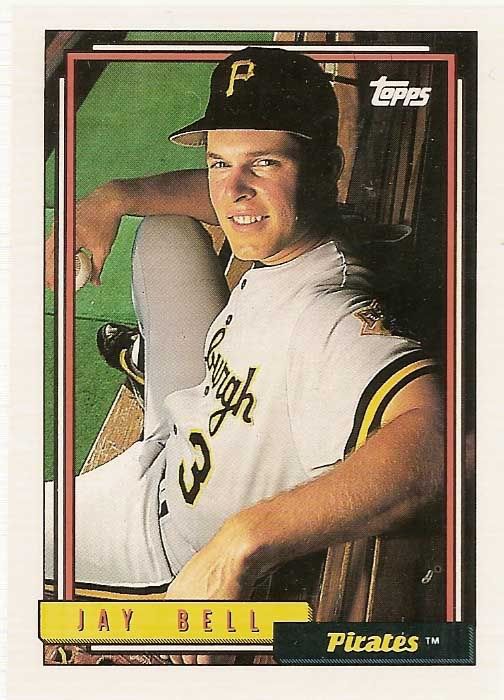
50) 1992 Topps

The '92 set featured some unique photography that largely still hasn't been replicated in style.  I love the dugout shots.  But when you get into the live action shots, the set gets pretty weak.  The photos aren't as crisp as they could be, and the sizing and cropping is terrible.  Add in a less than spectacular design, and the dugout photos and horizontal photography are really what save the set.


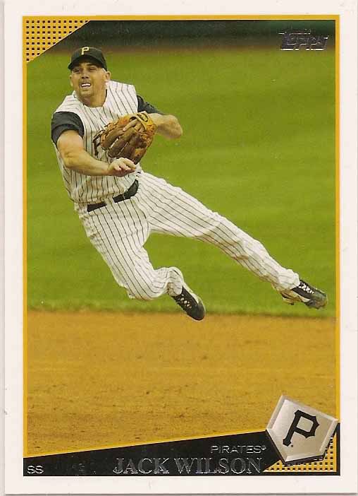
49) 2009 Topps

The 2009 set largely gets lost in the sea of late 00's white bordered sets.  There are some nice photos, but the player selection was unspectacular.  The Pirate roster certainly wasn't all that spectacular, but the checklist omitted quite a few players who played significant roles on the team.  Luckily the Heritage release from that season picked up the slack where Flagship left off.


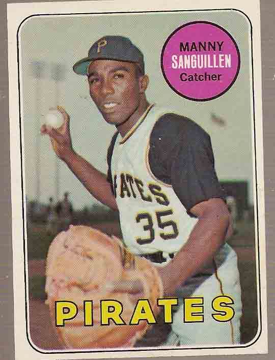
48) 1969 Topps

There's no purple.  That alone moves this set up the rankings.  But the photography makes some nice strides for the time, including some warm-up jacket photos and some more interesting posted shots.  Of course Topps manages to backtrack again in '70.


47) 2011 Topps

The Topps sets from the last 5 years or so really do run together.  They're all fairly similar aesthetically, and the photography has shifted towards using an image service rather than unique photography.

The 2011 set just feels very mechanical to me.  The circular logo at the bottom feels like a cog, and though I appreciate the minimalist text, the baseball logo feels like distracting overkill.


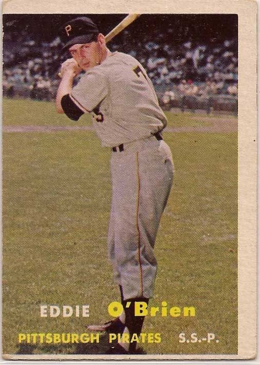
46) 1957 Topps

Our oldest entrant to date, the '57 set isn't a bad set.  But it does pale in comparison to its more colorful counterparts.  The design highlights the photography.  Which would be great if the photos were at all interesting.  This set won't hold its weight on nostalgia alone.