Showing posts with label Dave Parker. Show all posts

Wednesday, October 8, 2014

PWE Bomb from 2X3 Heroes

I haven't been very active in the trade market this year.  Life's kept me pretty busy, and way too stressed.  I've tried to keep up a fairly regular posting schedule, but there just isn't as much time for cards as I'd like most weeks.  Incoming packages have been more rare than in the past, so when a surprise comes in it's much appreciated.

And Jeff from 2X3 Heroes was kind enough to dig through my list to see what I didn't have, or is just a really good card picker.  But either way, he knocked it out of the park.  The package had some awesome new additions to my collection.  The Gold Sparkle cards are actually one of the few Topps parallels I've really enjoyed in recent years, and I've slowly been plugging away at the team set.  I think I have most of Series 1, but Update and S2 are still a work in progress.


 And if you want to talk about awesome pickups, this Cutch card takes the cake.  This is probably one of the coolest cards I've received in a trade all-time.  I'm thrilled Topps has brought back die cuts, and is actually keeping the concept fresh year to year.
 And keeping the theme going, this Cole Chrome base card goes great with the Refractor I got from the group break I posted yesterday.
Rounding out the package, this finishes my Pirates GOTG team set.  The 2000 GOTG set is hands down one of the most visually stunning sets ever produced.
And finally a card of two time Pirates minor league pitcher of the year Tyler Glasnow.  He's been blowing through the minors, and hopefully will continue that success right on to the majors in the next couple years.

Thanks, Jeff!

Friday, July 18, 2014

Less Binder, More Wall

I realize I have been posting a lot more memorabilia than cards in recent months.  For better or worse, my card pickups have been slowing down significantly.  There just aren't that many Bucco cards out there that a) I really, really want and b) are at a price I'm willing to pay.  

At current prices I won't touch most Cutch cards, and even secondary players like Marte or Alvarez go for more than I'm willing to spend.  

In the mean time, I've been able to pick up some awesome future wall decorations.  I'm sure the card bug will bite me soon (the National should be a good cure), but for less than a Cutch auto that would just go straight to a binder or box, I can pick up awesome pieces that I'll be able to see and enjoy day in and day out.

This bad boy came from my pickups at the Robert Morris show.  I don't know that I'm in love with the Fleer World Series cards on the sides, but otherwise this pieces is great.  If you look closely at the artwork you'll notice...not much worth capturing from the mid-late 90's.  Jason Kendall in the bottom right corner and Ricardo Rincon and Francisco Cordova commemorating their no-hitter.  Otherwise, lots of bumblebee uniforms.  

Friday, November 8, 2013

Group Break Goodies


(completely free and clear of Miley Cyrus references)

With what I posted earlier today, I would have been perfectly content if I walked away with just those hits for the $30 I spent on the break.  After all, group breaks are often a losing proposition.  To come away with not one but two autos?  Not a bad day.

But the cardboard gods smiled favorably upon me.  Things were just getting started.

This was card actually hit in the last box, but it's by far my favorite from the break.  I've had a bit of a cardboard crush on the wood minis since they were introduced in 2006 A&G.  Thing is that I've never been willing to shell out what the 1/1 would cost.  The Wood minis in Gypsy Queen are /5, so not quite the same pizazz as a 1/1.  But I'll gladly take it.  Russell Martin was by far one of my favorite Pirates this past season, so I couldn't ask for much more.

I already had the plain mini and black, so I may need to track down the green mini /50 to complete the mini rainbow.

Oddly enough while the break was very top heavy for me, there wasn't much in the way of lower end hits.  

I only added about a dozen new base cards, since I already had complete team sets from Gypsy Queen and only needed one common from Archives.  And aside from the Martin above, I was totally shut out on minis.  

Archives has quite a few Pirate inserts I'm missing.  I hit a pair of cards I needed, but they weren't any of the tougher ones.  Still, they're welcomed additions.


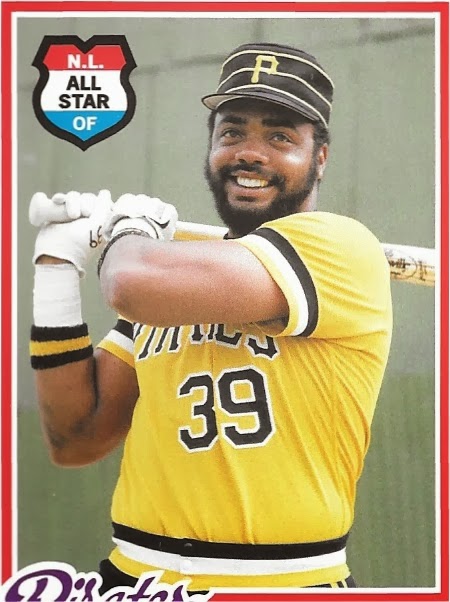
Really Topps?  You guys couldn't spend an extra 5 minutes in the archives to find a second photo of Parker to use?  Just.  Stay.  Positive.

The two boxes of Bowman Chrome we broke were largely disappointing.  With the insane number of refractor levels they've added to the product, I would have expected more hits.  But our boxes held just a couple of base refractors, a rookie reprint card, and one or two Cream of the Crop minis.  No fun and exciting color, leading me to assume Topps has cranked up the presses yet again this year.

Oh, but there was sooooome color to the box.

Boom.

I've long professed my love of gold refractor Pirate cards on this blog.  But gold refractor autos always fall above what I'm willing to pay, with even some of the most flamed out ex-prospects selling in the $10-15 range.

But Glasnow is no flamed out prospect.  He won the Pirates Minor League Pitcher of the Year award this past year, dropping an astounding 2.18 era with a 13.1 k/9 ration in low A at the tender age of 19.

It's tempting to sell, with completed auctions in the $100+ range.  But this card is just so nice.  I've always shied away from prospects (until they hit the bargain bin, that is), but Gladnow looks like he may be the real deal.  A 5th round pick, his 6'7 frame has the makings of a power pitcher.  Obviously he's still a long way from ever pitching an inning in a non-airbrushed black and gold uni.  But that is one niiiiice piece of cardboard.

Maybe I should keep on this group break kick.  Or buy a lottery ticket.  Luck seems to have turned in my favor lately.

Thursday, October 31, 2013

Trick or...Trick?


Nothing much going on here for Halloween, sadly.  Nightmare Before Christmas and some wedding cookies.  I guess I've managed to adapt to the married life pretty fast, eh?

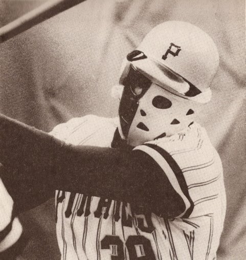
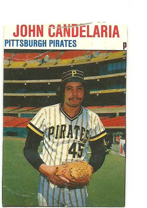
While the insanely terrifying Dave Parker axe murderer mask never made it to cardboard form, the Bucs did have something on the treat side of things: the Candy Man, John Candelaria.

As a kid, I always enjoyed the oddball candy - sure, I never minded a good Twix or Milky Way, but it was the more unique stuff that usually caught my attention.

The same goes for cards, particularly once you move into the vintage category.  The Topps releases from the 50's through 70's were, more often than not, strong sets.  They're loaded with star power and that ever-tempting nostalgia factor.

But fun?

If it's fun I want, then that requires a little more creativity. 

Hostess.  Kellogg's.  Apparently if you could eat it, you could find a cool card with it.  And for today, that is about as fitting as you could hope for. 

Hope everyone has a great Halloween.  While you're all trying to shake that sugar coma tomorrow, I should hopefully finally be escaping this wedding-induced zombie like state.

Speaking of which, make sure that Dave Parker image above isn't the last thing you see before bed tonight...

Tuesday, April 16, 2013

COMC Pickups: Odds and Ends

Shopping on COMC can be frustrating at times, since it seems clear some sellers have little to no interest in selling their cards at market prices, instead holding out for that one desperate buyer willing to overpay.  After attempting to negotiate with those sellers once or twice, they're unlikely to see my business again, even if they do eventually list something at a price I'm willing to pay.  But it's also a great place to grab up some nice (more common) inserts at great prices if you shop around.  The majority of these cards were around $.50, with the others costing only a hair more.

 I'm a sucker for early 00's parallels and inserts.  Maybe they can't hold a candle to the 90's in terms of design or collectibility, but they bring back some great collecting memories.  The Pennant Aggression is one of my favorite modern die cuts.  I pulled a Thurmon Munson from my solitary pack of 03 Fall Classic, but I'm much happier to have a Pirate from the set.
 Barnes was the Pirates 1st rounder last year in the supplementary round, and has looked impressive thus far in his short pro career.  The auto is on card, which was a nice surprise.
 This Pedro RC cost me a whopping $.75!  When he was first drafted, I paid $2 just for the base card.  Granted, Pedro's production has been less than impressive at times.  But it's still a great addition

 I love combo cards like this, though it would have been nice if Pops were in a matching jersey to Parker.
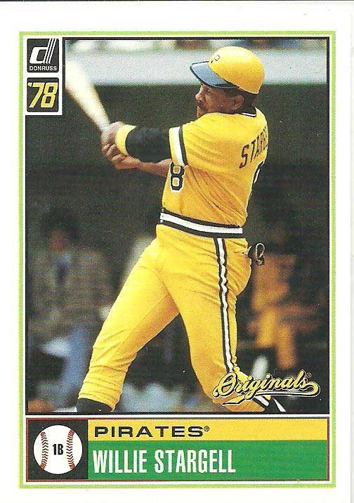
 Speaking of Pops, I swear I pulled a dozen of these cards from a box of Donruss Classics back in the day, but didn't add the Stargell until now.
 Talk about a clean design highlighting the player.  In this case, I love the vintage vest.

 This is an interesting card I only found out about semi-recently.  Jose Hernandez's time in Pittsburgh was far from memorable.  And for that reason, I had to have this card.  No idea where the jersey swatch came from though - perhaps a Brewers warmup jersey?
I love the look of these Prestigious Pros inserts, though the endless color combinations get a bit frustrating.  I believe this is the third of fourth version I have of the card, though they're all the higher numbered varieties.

Thursday, March 21, 2013

What If?


Alright, I'm over this Topps thing.  I swear.  Ish.

But it did get me thinking a lot about what the hobby has been missing out on the past few years, and the cards we won't see in the future.

But this isn't the first time the topic has come up.

I like the idea of cards that never were.  The "what if" factor allows the imagination to stretch its legs and think of how very different things could be, whether in the most minute or most overarching of senses.

And luckily for collectors, Donruss wasn't ready to leave these things simply to the imagination.  Donruss issued two "what if" themed subsets in the early 2000's that are among my favorite non shiny, non written on, not too vintage-y, plain old pieces of cardboard. 

In 2001, Donruss reentered the hobby after a two year absence.  Upon their return, they wanted to make up for lost time (and get some more mileage out of some really nice base card designs), inserting a second "pack" of one card in either the 1999 or 2000 style inside of packs of 2001 Donruss.  Double thepackripping fun! 


Donruss built upon the idea in 2002's Donruss Originals set.  The base set included current players in even yeared vintage Donruss designs (similar to Topps Archives; presumably an odd year follow up set got canned), with a series of What If? inserts that came up with time-travelling pre-1981 card designs and rookies that never were.


The concept and execution of the cards is really cool, and I'm a big fan of the hypithetical 1978 design.  Who doesn't love the Cobra in head to toe gold?  It would have been cool to see a Pirate in a 1979 design for their World Series victory, but I can't be too picky.  Well, maybe I can.  It's also worth noting the Bonds 1986 Rated Rookie shows Bonds in the latter stages of his Pirate career (most likely 1991 or '92), rather than picturing him in the pillbox hat and awkward fitting pullover jersey of his rookie season.

But these cards offer a little snapshot of what could have been that is both fun and a little bit depressing.  Who knows what direction cardboard history could have gone had sets been released those years.  Who knows what other inserts Donruss might have had in store for '99 and '00.  Ultimately we'll never know.  But perhaps that's part of the fun.


Monday, February 18, 2013

The Good, the Bad, and the Incredibly Uncreative: A retrospective of Topps Photography

The Topps brand is inexorably linked to the public conception of baseball cards.  To anyone from the most die hard collector to the most casual fan, Topps is an unmovable force in the baseball card industry.  Childhood memories are bound to the card designs of a certain year, the minute details of our most cherished cards branded into memory.

But cardboard nostalgia aside, Topps cards are as reliant aesthetically on their photography as they are on their card design.  And unlike the polarizing debates over card design, whether you love the wood grain '62 and '87 sets (I do), or think the '75 and '60 sets veered too far from the traditional formula (I don't), Topps photograph is a far more nuanced debate that seems to come up far less often.

The first twenty five years of Topps cards offered little excitement or innovation for collectors in the on card photography.  The cards followed a fairly predictable formula: posed photographs, typically in the team's home jersey, taken at the spring training complex.  It was a logical plan: spring training would most likely have every player who would suit up for a given team during the season, barring trades, and in the pre-merchandise savvy era, there was no concern about teams wearing eighteen different versions of their jersey, with 4 alternate batting practice uniforms.  Throughout the '60's, various season highlight cards would integrate full action shots, and the early '70's introduced the In Action cards, featuring large action photos. 

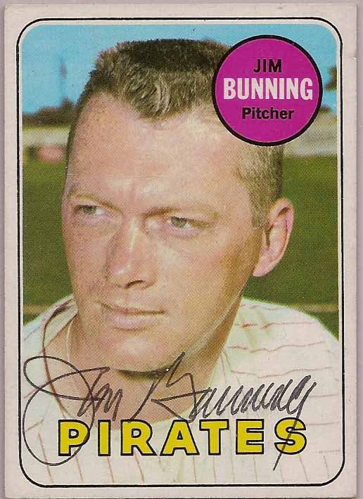
But the overall visual approach was fairly simple: if we have a photograph of that player in a vaguely current uniform, print it.  If not, pay an intern to do a half-assed job airbrushing out the old logo.  The result was a sequence of years using photos clearly from the same photo session of a player.  Or better yet, players who appear in a string of airbrushed photos.  For example, Hall of Famer Jim Bunning spent 1968 and most of 1969 playing for the Pirates.  Despite appearing in two Topps sets, his only card in an actual Pirate uniform wouldn't come until the 1990 Pacific Legends set.  Nice work, Topps.

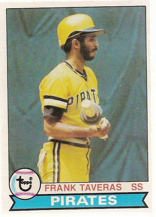
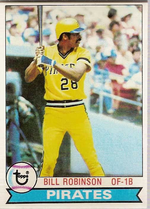
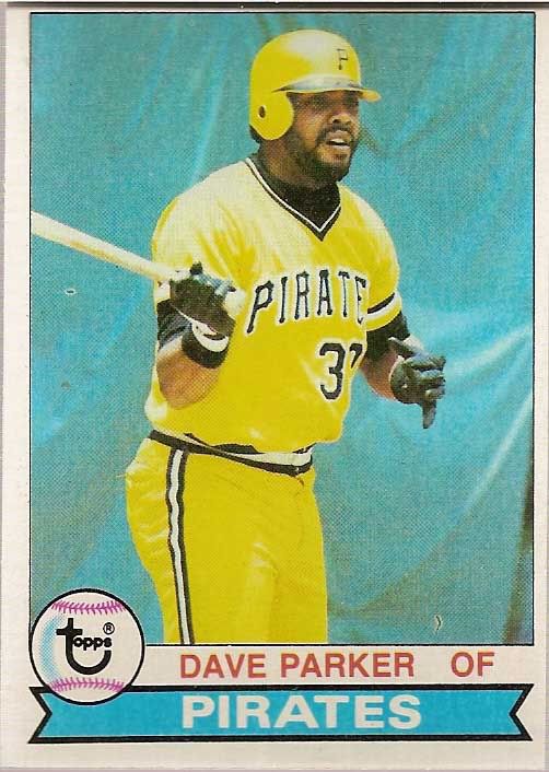
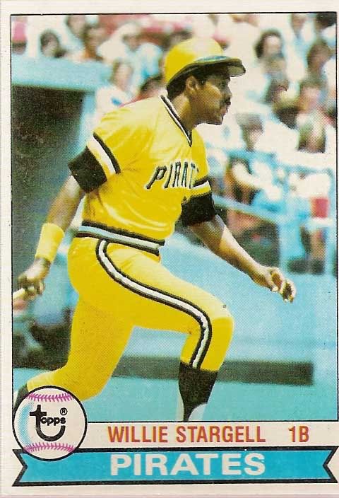
But even as Topps integrated more action shots into the base set by the late 1970's, the basic philosophy of getting as many photos as possible from one session still appeared to hold true.  The Pirates 1979 team set holds a special place in my heart for many reasons.  While it marks the last Pirates World Series victory, and a magical We Are Fam-a-lee club, it also marks an impressive feat in Topps photography.  I'll let the photos below speak for themselves.


Seeing a pattern here?

The late 70's Pirates were known for their mix and match jersey combinations that included white pinstriped, black, and yellow pants and pullover jerseys.  Instead, it would appear that almost half of the team set was photographed on the same day, in almost the exact same position in the batters box or on deck circle.  Talk about variety.


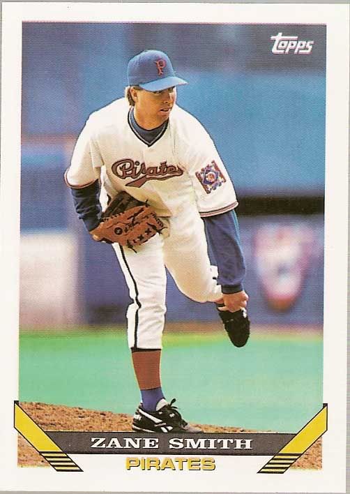
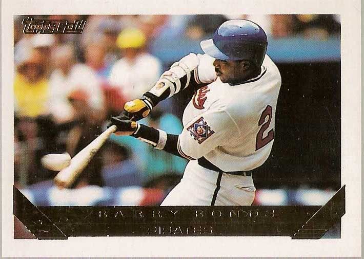
But it wasn't all bad.  Though the posed or pseudo action shots dominated much of the '80's, Topps included some great photography in the 1990's, perhaps not coincidentally coinciding with the development of the Stadium Club brand.  The 1993 set featured Zane Smith and Barry Bonds in 1938 throwback jerseys which the team only wore for one game. The jerseys are a unique nod to an 86-64 team that finished in second place, behind HoF'ers the Waner brothers and Arky Vaughn.  The '92 season marks the only time to date that the Pirates have worn the red/white/blue colored jerseys in a throwback game.


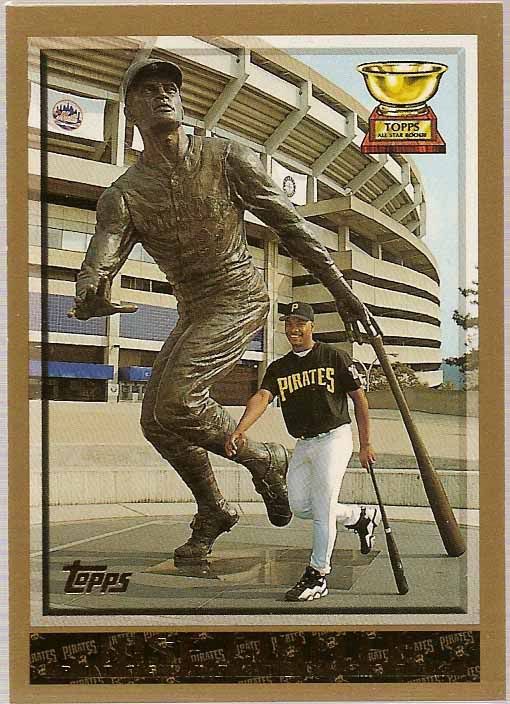
The photography in the 1998 set is perhaps my favorite of any Topps set, featuring an array of creative posted shots, horizontal photos, and unique action shots.  The Pirates team set also features two of my favorite Pirate base cards, #146 Jose Guillen and #365 Jermaine Allensworth.  At the time, Allensworth and Guillen appeared to be part of a young core of the Pirates (first) 5 year rebuilding plan.  Guillen's, a 21 year old Dominican right fielder with a rocket arm when he reached the majors in 1997 put up strong numbers for his age in his rookie season.  His 1998 card features him alongside the statue of Roberto Clemente outside Three Rivers Stadium, a parallel perhaps a bit ambitious for the promising Guillen, but one with unavoidable similarities nonetheless.  

Allensworth's, a first round pick in 1993 using the compensation pick gained from the departure of aforementioned Barry Lamar Bonds.  Drafted out of Purdue, Allensworth moved quickly through the Pirates system, reaching AAA by 1995 and featuring a high contact/speed combination that would become the hallmark for a revolving door of almost identical players for the following decade until the arrival of Andrew McCutchen.  Allensworth was one of my favorite players from 1997's Freak Show team that made an improbable run at the NL Central pennant.  Despite his pedigree and minor league success, Allensworth saw dips in his stolen base total and average which, coupled with his below average power, drove his OPS+ numbers into 80-90's.  He was traded to frequent trading partner Kansas City midway through the 98 season, and would see his last major league action with the Mets in 1999. 
Allensworth's 1998 Topps card features a great play at the plate at home against the Reds.  I love the way the elevated camera angle captures the play, and it's a bonus that the card features the Pirates black home alternates that were worn from 1997-2005.


Check back tomorrow for the second part of this series.  Tomorrow will take a look at the 2000's, as Topps reverts back to some of their old tricks, and the eventual discovery of licensed photography.