There have been plenty of black and gold additions in recent weeks. In fact too many, as the piles on my desk are starting to build to monstrous proportions again. But there are just too many fun cards in my collection that don't fall into the black and gold category.
Like this Tom Glavine card. I had no idea Glavine was also drafted in hockey (well, I probably did at some point - I imagine it was the blurb on the back of '94 Topps or something). This card is a pretty cool rendering. I'd imagine a hockey/baseball two sport star would be a little tougher to pull off than the football/baseball combo.
Say what you will about the early 90's. It's not my favorite period in card collecting either. But in the days before exclusive licenses and multi-billion dollar revenues, the main concern of sports leagues seemed to be getting their name/logo/players out there. Licenses were handed out like candy, with unique mainstream manufacturers and fun oddballs like this. Now that Topps pretty much controls everything and anything printed on paper that has an MLB logo (cards, minor league cards, stickers, in stadium advertisements and promos), I doubt we'd ever see anything like this again.
Speaking of things we don't see anymore, where have all the multiple exposure cards gone? I'm no photo expert, but I'd imagine with all the advances in digital photography card photos should be getting more interesting, not less. One of my friends is the team photographer for the Diamondbacks, so I'll have to do a little q&a if there's time.
And while we're at it...what the hell happened to sample cards? Oh, that's right. The internet. Sample cards are one of those fun collecting quirks that I love to add. Sometimes they're incredibly bland: samples of base cards. But there are some really nice onces, including samples of insert sets or this Pinnacle Certified sample. The scanner kind of killed the refractor finish, but the card looks awesome in person. And Bagwell was one of my favorite 90's players to boot.
This card had actually been well on its way to my "someday I'll set up at a show and sell this stuff" box. But I had second thoughts, and I'm glad I did. Donruss Estrellas was a poorly executed attempt at a retail only Spanish language set. I must say with the popularity of baseball in Latin America and Mexico, it is surprising that fewer companies have tried to tap into the Latino market. Early Pacific cards in the mid 90's and Estrellas. That's about it. But then again...when you have a monopoly...
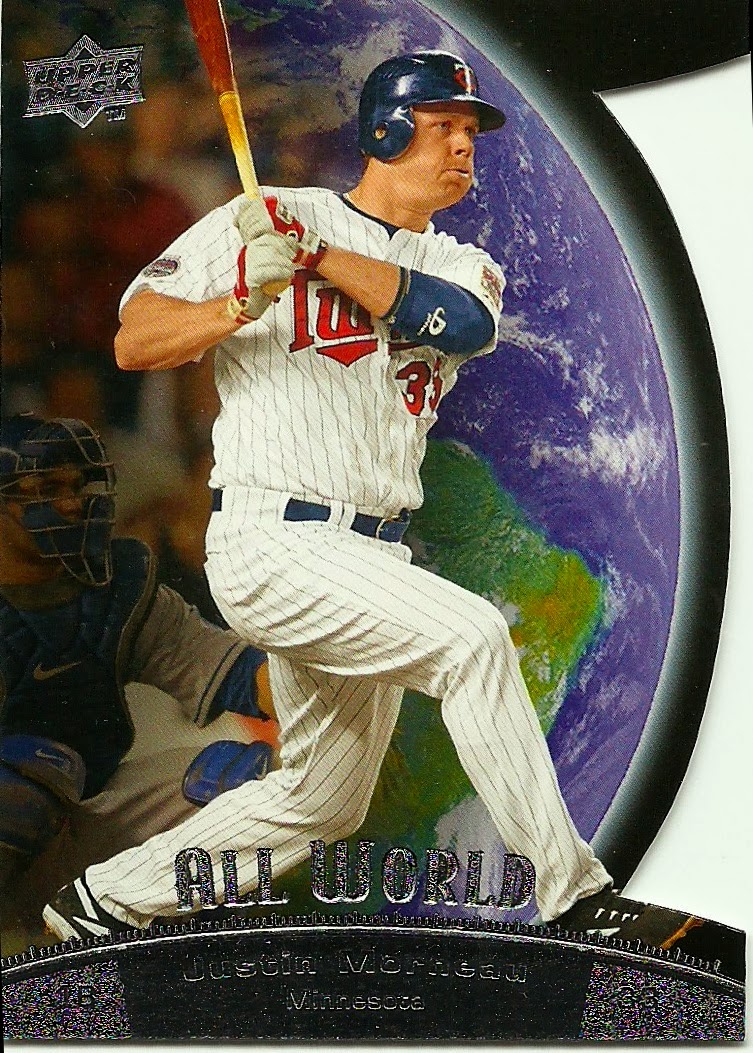
This Morneau is a another card that was slated for the "sell me" box. But his midseason trade to the Bucs has upgraded him straight from the move pile to binder status. And my Twins pages are sadly under represented, so it's a nice addition. Die cuts are all the rage with Topps right now, but this die cut in 2010 UD was the first I remembered seeing in a long time. Granted it's not the most mind blowing design. But hey...it's not Topps.
I have nothing to say, except:

The Crime Dog was one cool cat. Trucker hat baseball caps were not.
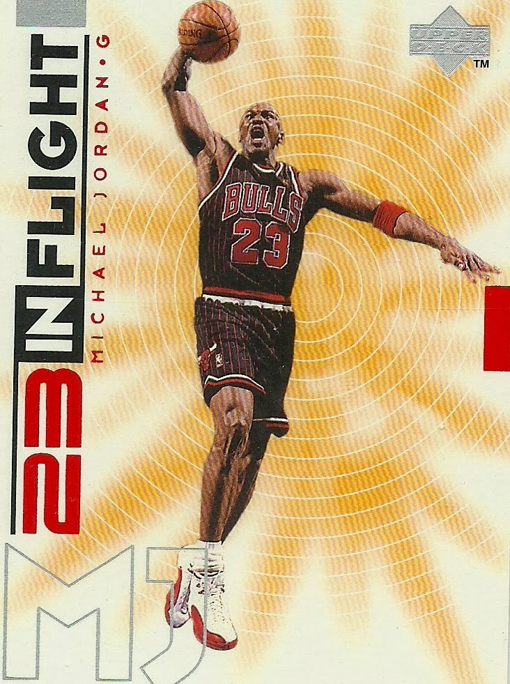
The pinstriped Bulls jerseys were a thing of beauty. I was a huge Bulls fan, but never a big Jordan collector. I can't explain it. But I do have a sweet Steve Kerr collection!
I've never been a big fan of Barry Bonds. Or overzealous expressions of patriotism for financial gain. Or those little American flags. But 2002 Studio was a gorgeous set, and this is a pretty great card. Even if the flag does look comically tiny in Bonds roided up arms.
And for a reminder of what Giants baseball should look like...Barry's godfather winning the MVP, in a much smaller size. I liked the Baseball Heroes releases Upper Deck did, and I think it helped add a more historical element to a company that was really just getting its feet off the ground. It's a shame they didn't continue with them, but obviously the company has much bigger issues these days.


No comments:
Post a Comment