
Considering I missed out on collecting all of 2017, I think it's a fair accomplishment to only be a couple weeks on jumping into 2018. Pitchers and catchers reported today, and it only seemed right to grab a couple packs of Topps while at Target last night.
Topps has been pretty predictable the last few years, and their formula for the flagship product was unlikely to change this year. I haven't been a fan of the changes since day one, but I've accepted them for what they are.
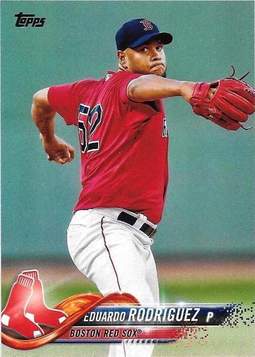
Topps seems to have at least backed down a little bit from their dystopian deus ex machina designs that they've been beating collectors over the head with the last few years.
This years design has softened a bit from the the futuristic designs of previous years. And that's a welcomed change. The name and team bars in team colors are a little more classic, and the flourish under the team logo is a nice callback to 2014 Topps. It's crazy how much the card designs and look have changed since just 2014, but that's a whole different topic.


I could do without all of the artificial glare and the team and name bars randomly disintegrating at the ends. But compromised must be made, I suppose. The borderless cards still feel out of place in Topps. It's something that I always considered the hallmark element of Stadium Club, and with both products existing concurrently it feels like they're stepping on each other's toes a bit.


But overall I don't hate this design. And after the last couple years had brought outright rage in me, that's a huge step forward. But the photo selection? That's another story.
I think it was somewhere around 2010 that Topps started using Getty images rather than the Topps photographers they had contracted with for years. It was a major shift. Topps had gotten cheap, lazy, or all of the above. Cards in Update and Series 2 would have Spring Training photos. Regular season shots were a rarity. Pulling from Getty's large photo selection resulted in some awesome action shots.
But like all good things, it can run its course. The photo style for Flagship is tight cropped, borderless action photos with some photo retouching to pull out the contrast. The end result can best be described as "blech." The photos look articial to me, like we're looking at these poses in a wax museum. And while Getty grabs some great shots, the tight cropping lends itself more to more routine photos. In two packs I pulled 5 cards of pitchers in almost identical mid-windup poses.

But there were still some fun cards in the bunch. I love these mashup uniforms the Mariners started wearing that pull together the early and mid 90's into one surprisingly clean and snazzy looking set of duds.

And over a decade in, the rookie logo is finally starting to look a little less intrusive. I barely noticed it on the cards I pulled.


I'm still not interested in Topps' messy Photoshop cards. Isn't this the same design as Fire or Triumph, or one of the other two-syllable brands that I can't tell apart and a box costs as much as a car payment? This card could have passed for a Diamond Kings insert for how well Topps masked the logos.

The real gem of the packs wasn't a card at all. It was a filler. I don't know much about this Home Run Challenge contest. It's probably a huge disappointment. But for a minute I had excited flashbacks to Collector's Choice Crash the Game cards. And that alone was worth the price of admission.
Overall verdict? This year is less bad than the last few. I still want borders and untouched photos. But if history tells us anything Topps tends to design sets in multi-year runs of similar designs. Hopefully this run is nearing an end. But it should be interesting to see how this design plays in Chrome.
No comments:
Post a Comment