No uniform fetish here, but I have always loved the uniqueness of baseball uniforms. I think it goes back to t-ball, quite honestly. The first team I played on had those lame 90's tshirt jerseys, red trucker hats, and my pristine white baseball pants. I couldn't stand it! I made a point to get those white pants as dirty as possible, often before the game even started, often times making a point to make exaggerated catches during warmups or make unnecessary slides in the dirt. The next year I was on a team with powder blue uniforms. I was traumatized, suiting up every weekend in such an uninspiring color. But perhaps we should save the rest of that for a therapist's couch...
I grew up in what I consider to be a great era for logos and uniforms. Great is a subjective term that many would consider synonymous with hideous. But those cartoony 90's NBA jerseys? Loved 'em. The drug fueled Turn Ahead the Clock promotion? My holy grail. And while I have developed a great appreciation for clean, classic uniforms as I grew older, I think those early years formed an appreciation for just how awesome a jersey could be.
So with spring training kicking off, I'm going to deviate from the cardboard ramblings for a moment and rank the uniform sets of all 30 major league teams. I'm looking just at the primary on field set, ignoring any one-off throwbacks or warmup jerseys.
30) San Diego Padres
The Padres overhauled a pretty meh roster this off season with some really exciting additions. But I am not exaggerating when I say that I couldn't watch the team on mlb.tv the past two seasons because their jerseys were too bland to stare at for 9 innings. I'd love to check out the new look team, but without a literal new look, I can't see it happening. Bring back the brown and gold!
29) Arizona Diamondbacks
Somewhere the desert threw up. That's about the only way I can explain the mess that is the DBacks uniform. It's a crazy world when your teal and purple colors actually look like a good idea compared to the current batch.
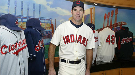
28) Cleveland Indians
This is a team that is at a bit of a crossroads, and could quickly shoot up my list with a couple tweaks. The team is clearly moving away from the racist chief wahoo logo, but the sad block C isn't any improvement. Retire the chief, and rebrand a featured logo. But their script Indians jersey is one of the best around, imo.
The "new" jersey just looks like a rehashing of the same design. And gold? Why gold?
26) Miami Marlins
The black jerseys feel sooooo 2004. But their orange jerseys actually match with the twisted art deco flair to their design and logo. Tubs and Crockett are proud.
25) San Francisco Giants
This is the lowest ranking of any of the "classic" jerseys. Why, you ask? Talk to that hideous orange jersey.
24) Milwaukee Brewers
The Brewers could be fighting off the Padres, if not for their classic throwback jerseys. The faded gold jersey isn't helping.
23) Houston Astros
I appreciate the fact that the Astros retired the hideous red/black colors. And the classic look is nice. But it's just kind of bland to me.
22) Atlanta Braves
Another victim of alternate-madness, the Braves have crapped all over a tradition-laden and nice home/road set with unnecessary alternates that look like batting practice rejects.
21) Texas RangersI liked the 90's red jersey set. I liked the blue jersey when it was reintroduced in the early 00's. What I don't like is the hideous 'Murica mix and match game they play. Red. Blue. Just pick one.

20) Cincinnati RedsAustin Kearns called and asked that you return the black trim to 2002.
19) Boston Red Sox
A couple years ago, the Red Sox would have been in my top 5. The blue font on the road jerseys and the unnecessary alternates made them take a "wicked hahd" tumble down the list.
18) Tampa Bay (Devil) Rays
The team exorcised the Devil, and started winning. But their uniforms weren't so fortunate. When your fauxback 1979 jersey is your best effort, you're in trouble.
17) Colorado Rockies
They get points for consistency, sticking with more or less the same jersey since their inception. But while I can stand behind the somewhat dated black/purple color scheme, the purple jerseys have seen more appropriate times. Barney, anyone?
16) The Angels of Somewhere in CaliforniaAnother victim of a team with a nice, and quite possibly modern classic, jersey set stretching to come up with an alternate. It's what all the cool kids are doing.
15) New York MetsDing, dong the black jerseys are dead. The blue alternates rock my socks, but the home/road set is a little uninspired. Bring back the 80's side striping!
14) St. Louis Cardinals
The decision to start wearing red hats on the road just looks so wrong. Had they stayed the course, this would be a top 3 team.
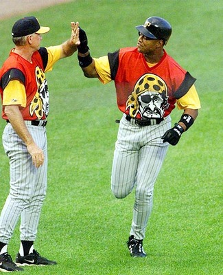
13) Pittsburgh PiratesNo hometown bias here. I've grown to like the Bucs blackout jersey. The Sunday alternates make my life a better place. But the block lettering on the road jersey does nothing for me. Pittsburgh is a word best spelled in script.
The black jerseys feel sooooo 2004. But their orange jerseys actually match with the twisted art deco flair to their design and logo. Tubs and Crockett are proud.
25) San Francisco Giants
This is the lowest ranking of any of the "classic" jerseys. Why, you ask? Talk to that hideous orange jersey.
24) Milwaukee Brewers
The Brewers could be fighting off the Padres, if not for their classic throwback jerseys. The faded gold jersey isn't helping.
23) Houston Astros
I appreciate the fact that the Astros retired the hideous red/black colors. And the classic look is nice. But it's just kind of bland to me.
22) Atlanta Braves
Another victim of alternate-madness, the Braves have crapped all over a tradition-laden and nice home/road set with unnecessary alternates that look like batting practice rejects.
21) Texas RangersI liked the 90's red jersey set. I liked the blue jersey when it was reintroduced in the early 00's. What I don't like is the hideous 'Murica mix and match game they play. Red. Blue. Just pick one.
19) Boston Red Sox
A couple years ago, the Red Sox would have been in my top 5. The blue font on the road jerseys and the unnecessary alternates made them take a "wicked hahd" tumble down the list.
18) Tampa Bay (Devil) Rays
The team exorcised the Devil, and started winning. But their uniforms weren't so fortunate. When your fauxback 1979 jersey is your best effort, you're in trouble.
17) Colorado Rockies
They get points for consistency, sticking with more or less the same jersey since their inception. But while I can stand behind the somewhat dated black/purple color scheme, the purple jerseys have seen more appropriate times. Barney, anyone?
16) The Angels of Somewhere in CaliforniaAnother victim of a team with a nice, and quite possibly modern classic, jersey set stretching to come up with an alternate. It's what all the cool kids are doing.
15) New York MetsDing, dong the black jerseys are dead. The blue alternates rock my socks, but the home/road set is a little uninspired. Bring back the 80's side striping!
14) St. Louis Cardinals
The decision to start wearing red hats on the road just looks so wrong. Had they stayed the course, this would be a top 3 team.
13) Pittsburgh PiratesNo hometown bias here. I've grown to like the Bucs blackout jersey. The Sunday alternates make my life a better place. But the block lettering on the road jersey does nothing for me. Pittsburgh is a word best spelled in script.

12) Toronto Blue JaysThe team made a wise choice in returning to a classic look, and this is one case where I really like the team-specific numbers font. They only slip down the list for waiting so long to go back to this look. I am a spiteful ranker! Muahahaha.
11) New York Yankees
Can't argue with a classic look. But it may look like a pajama party this year with CC and Arod hobbling around with pants 3 inches past their ankles.
10) Detroit TigersClean, classic, and the orange accenting is perhaps the nicest in baseball.
9) Los Angeles Dodgers
There's a fine line between classic and stale. The Dodgers still manage to keep the arrow pointing towards classic.
8) Chicago White Sox
The White Sox were going for a world record in most uniform and color changes through the 20th century. They stuck with a look since '93, and were rewarded with a World Series trophy. Perhaps the nicest pinstripe jersey in the game, and the black alternate still doesn't look dated.
 7) Washington Nationals
It took the Nats a few years to find their groove, but their crazy mix and match look reminds me of the 70's Pirates. A 70's Pirates team that thinks the 4th of July is every single day.
6) Philadelphia PhilliesThe only thing this team can do right is their jerseys. At least they'll look nice being the worst managed franchise in baseball.
5) Kansas City Royals
If we learned anything from last year's playoff run it's that the team should just go with the powder blues full time. I'm still a fan of the home white jersey though, which really accentuates the blues.
4) Chicago Cubs
There's a fine line between classic and stale. The Dodgers still manage to keep the arrow pointing towards classic.
8) Chicago White Sox
The White Sox were going for a world record in most uniform and color changes through the 20th century. They stuck with a look since '93, and were rewarded with a World Series trophy. Perhaps the nicest pinstripe jersey in the game, and the black alternate still doesn't look dated.
It took the Nats a few years to find their groove, but their crazy mix and match look reminds me of the 70's Pirates. A 70's Pirates team that thinks the 4th of July is every single day.
6) Philadelphia PhilliesThe only thing this team can do right is their jerseys. At least they'll look nice being the worst managed franchise in baseball.
5) Kansas City Royals
If we learned anything from last year's playoff run it's that the team should just go with the powder blues full time. I'm still a fan of the home white jersey though, which really accentuates the blues.
4) Chicago Cubs
The team's procession of throwbacks over the past few years has won my heart. Even the redesigned road jerseys last year were nice. I do want to see the blue jerseys more often, though.
3) Baltimore Orioles
The shift to a more classic look was a great decision. The number of alternate looks? Less great. Still one of the best dressed teams in the majors.
2) Oakland A's
Green and yellow is pure genius. And the Packers agree. It's a unique look in baseball, and they have really done alternate jerseys right. The alternate looks don't look forced, and look like fitting additions to their classic scheme. And...script font!
1) Seattle Mariners
Bringing back the emerald jersey was the best move the team could make aside from signing Cano. Their new Sunday retro alternates are a thing of absolute beauty. And despite being a log that screams 1990's, their primary logo has stood the test of time.
Those turn ahead the clock jerseys go for a ton of money on the secondary market.
ReplyDeleteI saw a Pirates on on ebay a year or two ago that ended for $300. I still keep holding out hope one of these days I'll come across one in a thrift store.
DeleteIt's tough to even find pictures from the game for some of the jerseys.
Nice list. I won't hold it against you that you have the Yankees out of the top ten :p
ReplyDeleteI am more of a fan of the classics. The Yankees, Cubs, Dodgers, Giants, Tigers would be in my top 5. I love the Orange jerseys that the Giants and Orioles sport. Love the Phillies Sunday throwbacks as well as the Braves throwbacks as well. Wish the Mets would go back to their pinstripes all the time. Hate their all white unis, but I do like their blue alts. I think they should go back to the blue alts that say Mets across and are pullovers like the ones they wore in the 80's. I wasn't a fan of the racing stripe they used back then. I think the Royals unis are Dodger rip offs (Sorry Tromp), but I do love the Powder Blues as well as St.Louis's powder blue unis from back in the day.
I could go on and on with this subject as I too love sports uni's.
The list was very, very subjective :p
DeleteOne thing I really enjoy about uniforms is looking at the way they evolved along with the game and pop culture. The bright, loud pullovers of the 70's and a strange fascination with powder blue, the more muted and low key uniforms of the 80's, then the crazy cartoonishness of the 90's, the obsession with everybody adding a black jersey in the late 90's/early 00's, and I think now we're in the retro stage where teams are looking back 1-2 generations and either readapting or just plain bringing back old unis.
As a Steeler fan, I can appreciate the classics that have been unchanged for 40+ years. But change can be fun too - unless of course it's those "Serial Killer Sailor" Islanders jerseys.
Oh, now your just being evil, lol!
DeleteMan oh man... how I'd love to see the Padres go back to their brown and gold uniforms.
ReplyDeleteEnjoyed the list and for the most part I don't disagree with you. I wouldn't go so far as to say that we're in a "Golden Age" of uniforms, but we are at a time where the worst uniforms are either dull or "I don't care for it"... There's nothing out there that makes me wince every time I see it.
ReplyDeleteI think that the Astros would look a lot better with a different font on their jerseys, and the Padres & Rays would greatly benefit from judicious application of a bright accent color.
But I am not exaggerating when I say that I couldn't watch the team on mlb.tv the past two seasons because their jerseys were too bland to stare ... bjerseys.blogspot.com
ReplyDelete